Wednesday, April 8, 2020

Translation and Abstraction

Olivia Collins 
Cindy Rehm 
April 8, 2020
Translation Abstraction 
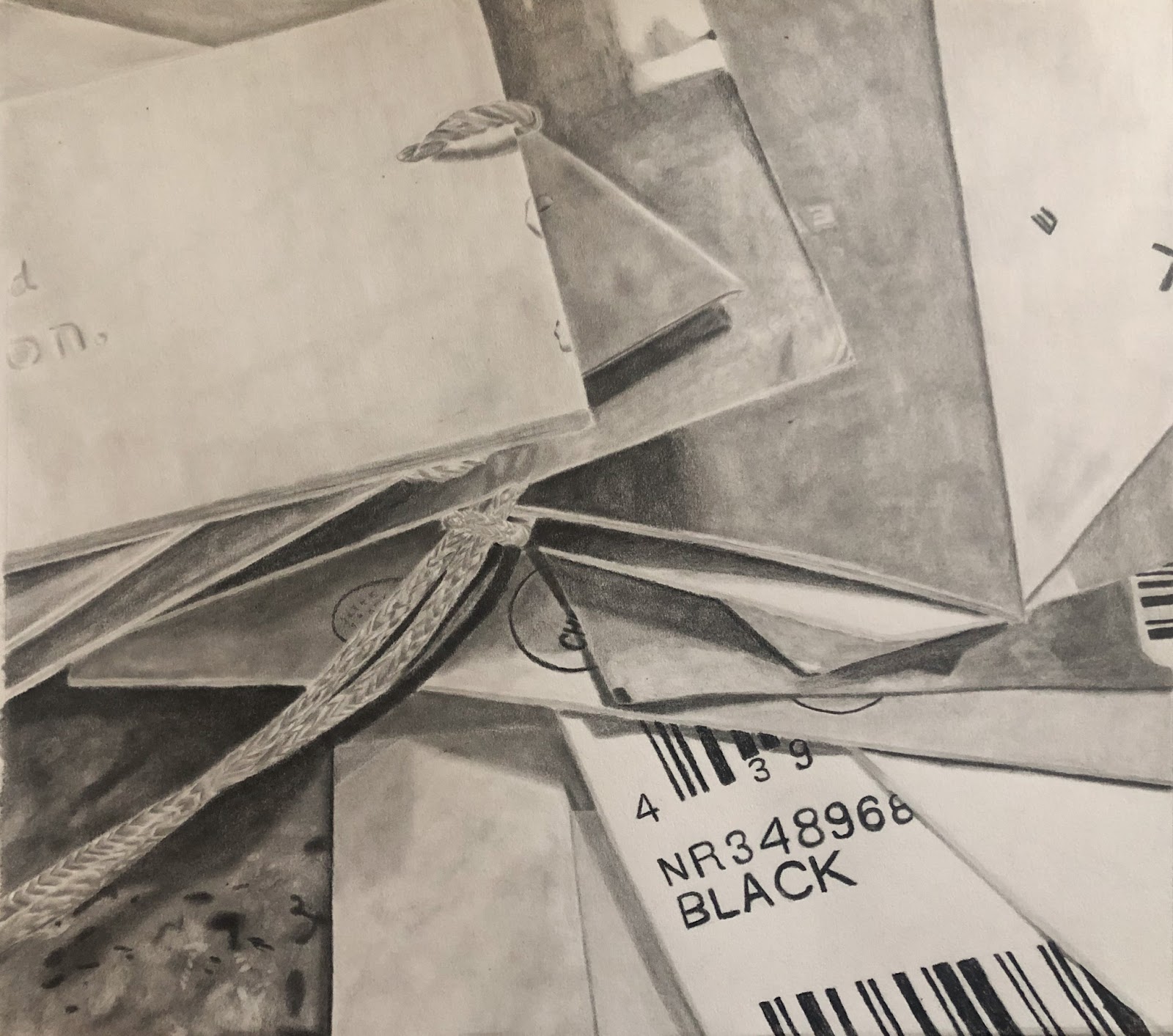
The process for my piece was to enlarge the pieces from my collection. My collection consisted of many tickets from the past several years. Each ticket is relatively very small so the most effective way to make a new piece from them is to enlarge them. The actual collection featured more than 40 individual tickets so for the drawing I chose a handful to magnify. The enlarging process was tedious since the tickets are full of text. I first started with a one big sketch of how many tickets I wanted in the piece and used this as a reference. I used a variety of pens to do all the text and then lastly finished the piece in watercolor. Although there were a majority of tickets that were just black and white, I wanted to utilize color to exaggerate the tickets more.
I was inspired by artists who rely on zooming in to their subjects or objects to create a more abstract representation. From the lecture, I looked at Sydney Croskery’s work. Her work was helpful to reference because she had similar subject matter as me with drawing tickets and other simple everyday objects. Her composition is always interesting with how the objects are placed and sometimes overlap. 
Another artist I looked at was Domenico Gnoli. His body of work is all about extreme closeups of objects. His pieces will only contain one object instead of a variety like Croskery's work. He makes detailed paintings that rely on the shine from the object of different strands of hair.


My collection


My drawing


Sydney Croskery


Domenico Gnoli

Tuesday, April 7, 2020

Translation/Abstraction Project

Niki Ravari
ART 318

For my project, I wanted to use one of the teddy bears from my collection to make abstract marks onto drawing paper. First, I experimented with mixing acrylic paint and water to create the pigment for mark making, but found that mixing the paint with water made the color less vibrant. I decided to use the acrylic mixture in red for just a small section of the piece to add a pop of color and used India ink for the majority of it. I found that India ink was the best medium for mark making because it is so pigmented while being wet enough to easily paint onto the teddy bear. I applied the ink onto the ‘fur’ of the stuffed animal with a brush then lightly pressed the fur onto the paper to create a repeating pattern. I continued layering these marks until I was happy with the composition. Once I was happy with the piece and let it dry, I trimmed the edges making the final piece 14” x 20".

Gerhard Richter is a German visual artist whose abstract paintings stand out to me. He incorporates various textures by layering many colors into each piece. He has a fascinating way of using colors, overlapping them in a way to give the piece depth using many unique colors. His use of color is what led me to decide to incorporate red into my piece, rather than using only black India ink.

Christine Ay Tjoe is another abstract artist whose work I wanted to mention. My favorite work by Tjoe is titled Small Flies and Other Wings (2013) and contains an abundance of chaotic marks that create a grand composition, mainly in pink. The piece seems to contain many different mediums and layers, making it much more interesting to uncover. This is a very special work for me and inspires me to want to create more abstract works, which I don’t normally do.


Translation and Abstraction (Josie)

For the mindset of this assignment, Abstraction and Translation, the two artists that served as my inspiration were abstract artists, Sharon Kingston and Agnes Martin.

As one can observe through their artworks, it can be seen that each have different styles of portraying their subjects.  For instance, in Agnes Martin, there is heavy emphasis in geometric shapes and lines. Quite contrary to her earliest works that played with organic forms, her current abstract expressionist art style resembles to that of astute and definite notions.  With geometric lines, the mathematical concepts details to the audience that there are precise movements that do not deter from their designated path. In addition, her devoted following to Zen Buddhist belief further promotes the idea of “acceptance” and “un-interruption”.  As quoted by her, her works represent “a world without objects, without interruption… or obstacle. It is to accept the necessity of… going into a field of vision as you would cross an empty beach to look at the ocean”.


In contradiction, Sharon Kingston is a local Seattle-based artist whose artwork mainly consists of clouds and transcendent, atmospheric pieces.  Unlike Martin who placed emphasis on the geometric model, Kingston does not center her pieces on following a strict, linear path. Rather, her process of oil-based painting offers a flowing and un-contained effect.  In my favorite piece by her, “flowing and unfolding”, I am captivated by the broad brushstrokes and the contrast of juxtaposing colors of light pink and white with dark blue and grey.


In summary, while Martin’s practice is on geometric shapes that offer “limits”, Kingston’s works on flowing subjects offers the feeling of “limitlessness”.  In my art piece, I aspired to combine both notions to confuse my audience on the concept of constraint and placement. When visualizing my work, the idea of constraint can be seen through the grid lines, however the background of the blended brushstrokes contradict the notion of constraint.  Therefore the question that arises is, “are the brushstrokes confined to a secluded box?” Next, the idea of placement is promoted by the use of grids. Grids are often represented as tools to indicate or locate a certain spot for an object. However in my piece, the flowing brushstrokes cause the audience to think if “the brush strokes were purposefully placed in the grid and that there is a certain designation for them?”.  Therefore in summary, the ideas of limits and limitless are questioned in my piece.

Translation/Abstraction

Since my collection of vintage Playboy magazines contains hundreds of photographs of the female
body, I wanted to depict the feminine form through abstraction. My objective was to merely suggest the outline
of a woman; to evoke feminine sensuality rather than replicate it. The goal of this abstraction was not
to desexualize the source material, but rather to refute the notion that sensuality is inherently explicit,
graphic, or overt. I created my abstractions with an emphasis on two specific elements: line and contour. 
For the line element, the artist from whom I drew inspiration was Bridget Riley, specifically her black and
white op art work from the 1960s. Through simple lines, curves, angles, and repetition, Riley was able
to produce sensations of movement, even supposedly evoking feelings of seasickness or skydiving.
Although they are disorienting and dizzying, her works are also oddly tranquil. The smooth curves, fine
lines, and overall precision involved in creating these optical illusions suggest a certain patience and
attentiveness. I was particularly inspired by the three-dimensional curved effect shown in the included
image: 


For the contour element, the artist who inspired my abstractions was Ruth Asawa. Made from wire, her
sculptures are bulbous, fluid, and have always felt decidedly feminine to me. I used her sculptures as
reference when attempting to convey convex and concave forms. Although her sculptures are three-
dimensional, the delicate process of sculpting with wire is actually very similar to the way that I
approached my line drawings. 


By combining aspects of Riley’s line work with the contour of Asawa’s sculptures, I created abstract
drawings inspired by my Playboy collection. I decided to focus on close-up areas of photographs from
the magazine in order to create even more abstract forms. I experimented with both black ink on white
paper, and white ink on black paper. I actually think I prefer the black ink on white paper. It definitely took
a few tries to get the technique right, since I’m used to drawing in a more photo-realistic style. I’ve
included my last two attempts, which I believe are my most successful.


Translation/Abstraction Project

My collection project was a grouping of small polaroid images that reflected small flashes of my daily life. With this translation project, I wanted to capture a similar idea. I liked how the varied images all were contained in such a small format and attempted to use not only the same size images in this project, but also the actual objects themselves as mark-making materials. I took 9 of the photos and traced them next to each other into a shape with the same dimensions of one of the photos, only on a much larger scale. I then measured out the white space in one of the small photos and added this inside the drawn rectangles. As far as the actual drawing, I wanted to do an abstraction of one of the photos that I took for the original collection assignment. I chose an image I had taken from my collection of the inside of my refrigerator. I sketched this as a zoomed in (but not to the extent of abstraction) version. I then cut the image into 9 smaller pieces that all fit to the smaller squares within the traced polaroids. I glued the pieces onto the drawn frames in an entirely jumbled format. While it was originally a visually logical photo, I moved all of the pieces around to not make sense together. Some of the images are familiar and contain recognizable elements but put together, the original idea is not clear. This is reminiscent of my original project in the sense that all of the photos contain the same theme, but entirely different subjects. Here is my process and the final result:


A few artists that inspired this piece are Adam Lister and Cy Twombly. Adam Lister creates mostly watercolor paintings that are in a pixelated style. This was part of my inspiration because my original idea for this piece was to pixelate an image. After trial and error, this transitioned into the final outcome of simply jumbling the pieces that were cut into small (somewhat stylistically pixelated) squares. Here are a few of his works:


Vermeer’s The Concert by Adam Lister

adam lister, Introducing Adam Lister


Cy Twombly is mostly known for his paintings, but what I discovered through research were his polaroids. He photographed mostly nature and a large majority of these pictures are very close up and abstracted. I love these vintage photos and assisted me in trying to find abstracted polaroids for inspiration. Here are a few of his photos that I liked:

Cy Twombly


Cy Twombly's Celestial Photographs -   Picasso.

Monday, April 6, 2020

Translation/ Abstraction

While collecting the items that I used in this piece was fun, drawing them was a whole other story. I haven’t drawn with graphite in a while, so jumping back into it wasn’t intimidating, but the pressure was on a little bit. Before I developed more of an interest in painting, graphite was the main medium that I used and it’s what I was known for in middle school and high school. So, when it came to drawing this assignment, I didn’t want to be as hyper critical of myself as I was in the past. I wanted to just be able to draw and take my time, and love the process rather than the result. I chose to do an up close drawing of my collection because I never really play with scale, so I felt that doing so in this project would introduce me to something new. I took my collection and arranged them in different ways, took pictures of them, decided which one that I like the most, and then started drawing it.
Sydney Croskery was one of the artists who’s methodology that I used when approaching this project. She draws papery objects as well, which is similar to the tags that I drew, and her process looks relatively simple. I appreciate how she didn’t take a hyper realistic approach to drawing her objects, but was still able to make it look accurate and interesting. I also appreciate her attention to detail in terms of the little folds in papers or the really light shadows that they cast. Robert Longo is an artist who I use inspiration for all the time. I think I first saw his work in SFMOMA when I was 16, and I’ve admired his work ever since. I adore the range of colors that he’s able to achieve in his drawings, as well as the deep blacks that look like paint rather than graphite. Anytime I look for inspiration or motivation for my work, I look at his.

Thursday, April 2, 2020

Translation/Abstraction Project

Elizabeth O’Toole
Professor Rehm
Advanced Drawing
8 April 2020
Translation/Abstraction
Color & Form Exploration
As a continuation of our collection project and for our translation/abstraction piece, I wanted to combine layering of imagery and close up abstraction to put objects within a new context and create a new space from the objects in my green collection. I was inspired by the work of Sydney Croskery which we discussed in class along with collage style works from artists like Martha Rosler. I loved the way Croskery seemed to make sense of differing objects within the picture plane. She was able to create very effective black and white drawings with a lot of value and smooth shading. Her overall style and ability to combine unlike objects inspired my combination of items from my series. I wanted to use this manner of layering and combining imagery in my piece. But while I love the manner in which she puts pieces together, I have also always been inspired by the potent and moving collage works by Martha Rosler. While I cannot say my work holds the same political thematic content hers do, I wanted to find a way to combine seemingly opposing imagery to form a new cohesive idea.
         My work more than anything serves to continue exploring the emotive nature of color and space. Just as my collection project sought to explore the feelings and associations behind a color like green, this piece takes it a step further by involving forms and enlarged or abstracted objects within the picture plane. This piece combines only objects and imagery from my collection to create a whimsical, nonsensical setting. I used chalk pastel in only green, black, and white, on 34 x 44 inch natural colored paper with textures and objects from my collection to develop a new type of translation of my original exploratory concept. This piece is not necessarily to be looked at to decipher a political idea or message, but rather it is meant to be felt and understood however the viewer chooses.