Wednesday, April 29, 2020

Symbolic Self Project

Symbolic Self Project

For my symbolic self project, I took inspiration from my childhood. I did ballet starting when I was 4, and up until 10th grade, and it formed a major part of my self-identity throughout growing up. Ballet classes required a lot of concentration and discipline, and helped me gain confidence and a sense of accomplishment in my talents. It also allowed me a creative outlet to express my emotions through movement, and make friendships outside of school. Because of this, I decided to draw ballet slippers as my symbol of self. After watching the How to Draw a Bunny documentary, I was inspired by Ray Johnson's collages, and how he repeated certain images throughout an entire collage. I re-created this through mono-print techniques, stamping with textured objects, collage, and glitter.

The Process
The background:

First, I took an 18 x 24 piece of drawing paper, and began drawing squiggly lines with a black drawing pen, to form various squares and rectangles on the paper. Next, I took black India ink, and mixed it with water to form a washed gray background in some of the sections of the piece. I directly poured this mixture onto the paper, and moved the paper around to cause the ink to drip off the paper in certain directions. After that, I dripped more pigmented black ink to the damp paper, to add more value to the grey washed background. After this, I repeated the same process with magenta, purple, red, green, and yellow India ink. I mixed various colors together to add more texture and pattern to the paper. After this, I blotted the pools of ink with a paper towel, and stamped this pattern onto the two colored rectangles to add more texture. I then went back with my black ink and painted over the squiggly lines in the paper, as well as splattered it onto certain parts of the piece. 


The ballet slippers:

First, I began creating the mono print images of the ballet papers by rolling printmaking paint onto a plastic slab and then drawing various positions of ballet slippers with a q-tip. Then, I transferred these images onto different colored construction paper, and added glitter to the wet paint. 


Next, I cut out these images with an X-acto knife to exaggerate the shape of the slippers, and pasted them onto the piece with a glue stick.
My final piece looked like this:


Inspiration:
I took inspiration from Ray Johnson and his collages, as well as Ellen Gallagher. I liked how Ray Johnson repeated certain images or objects throughout his collages, and how Ellen Gallagher utilized mono-print techniques in many of her pieces, as well as added many different textures as an element of her art. The two images below are specific works from these artists that especially inspired my piece. 
Ellen Gallagher. Hare. 2013.

Ray Johnson. Wake Up. 1973


Tuesday, April 28, 2020

Symbolic Self


Symbolic Self
Niki Ravari

For this project, I knew I wanted to create a piece with oil pastels because it’s a new medium I really enjoy working with. I also wanted to relate this project to the current situation and portray myself in a way that is consistent with how I feel now. Since I have been spending the majority of my time focused on creating art, I drew myself using vivid colors as a way to embody my creativity and how I feel rather than using a realistic skin color. I drew my body in poses that are withdrawn, in a way that the figures seem isolated, even though they are in the same piece. This theme of isolation also prompted my decision to make the background completely black. I wanted to go over the piece with a thin white paint pen to create highlights and outline the figures. I am hoping to still add this line-work once the materials arrive!


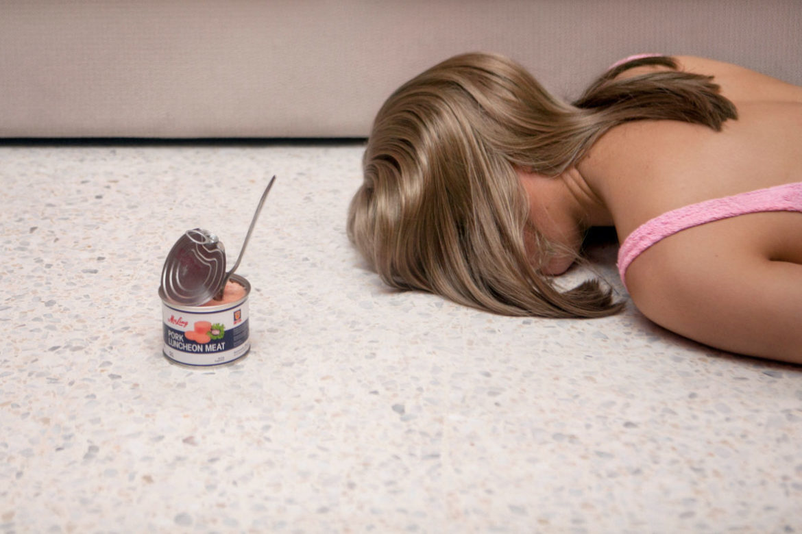
An artist that we learned about in the lecture that inspired me for this project is Juno Calypso. Juno Calypso is a photographer whose self-portraits speak to similar themes of isolation and loneliness. Her self-portraits are what sparked my initial idea to go in this direction with my drawing.
Juno Calypso. The aesthetic perfection against the aesthetic ...


Monday, April 27, 2020

Symbolic Self - Zane


I've always had issues with representing myself in any artistic medium, and I rarely even show my own face in a photo on social media. This is extreme to the point where all of my profile images on any platform is at most an outline of my features. Typically when I draw people I exaggerate features, change their skin color, add objects onto their head or face, that may say may more about them, or just completely abstracts their image. This is partly because it interests me, it teaches me more about oddly shaped forms, and I don't like drawing face or normal things. When approaching this assignment, I definitely wanted to use symbols and alternative imagery to suggest what my interests are. I also wanted to use the techniques and style to describe who I am. In my portrait, I mainly utilized the artwork from two different album artworks; one being from Van Halen's, "Dive Down" and Pink Floyd's, "The Division Bell".

The graphic style that I used is also indicative of how I am attempting to represent myself. I've been developing a more, graphic, graffiti-esq, style that I creates a more pleasing image when combined with elements that display precision, such as using a border, or having dynamic, sharp lines that indicate pre-planning. I have an OCD personality type and I like to be in control of the worlds I create in my art work. I was trying to treat this project as not only a representation of myself, but a representation of myself through process and the final product. I hope this all makes sense.

Here is my artwork. I really like planning what I make to work on the medium that I'm working on. The 18x24" paper made me think of making a poster, and I believe that my graphic style really lends itself to this medium.

Symbolic Self - Olivia Collins

Olivia Collins
Cindy Rehm
Advanced Drawing
April 27, 2020
Symbolic Self

My symbolic self portrait is a series of three. Something I find symbolic in my life is what I wear. I wanted my portraits to be full body but very simple. I was most inspired by fashion sketches however I did not want myself in any particular poses. I wanted to showcase how with different clothes I take on a new persona. My first piece I wanted to focus on what I look like at home while I work. This is a version of myself that not many see. I spend most time working in my older brother’s big hoodie and glasses. These are two crucial items that I wear almost daily but no one would know. My second piece is to emphasize my collection of band tee shirts. Similar to when talking about the collection project, I have many band tee shirts that are very important to me. I decided to have myself wearing my dad’s My Life With The Thrill Kill Kult shirt from 30 years ago which is my personal favorite. My most worn shoes are over the knee boots so I am seen with this in the painting. I wanted to show how I often wear my family’s clothes and how they are representative of me. My last piece was to showcase my love of dresses. I own several all black dresses and different dresses in general so this is another aspect of what I look like that still represents me. I needed one of the portraits to also showcase my long straight hair, since it is hidden in the first and in a ponytail in the second. It was important to me to not have my face in any of the pieces because I wanted the clothes alone to represent me as a whole. I also predominantly wear black so I wanted the series to portray that.


Inspiration: 
   
Jean-Paul Gaultier                              Tom Ford 

Symbolic Self

Self-Portrait Blog Post

I’ve never liked self portraits. No matter what class I’m in, I’m asked to draw myself in some way, and I never find it enjoyable. I can render faces well, they just never look like the people who I drew, so you can imagine what a poor job I did with myself, especially when staring at yourself in the mirror or in a picture for a prolonged period of time isn’t natural. When it comes to creativity, it’s a lot easier for me to cast it onto figures other than myself.
I decided as a self portrait that I would depict my hands burning a photo of myself as a child. When I was younger, I loved my childhood because I had nothing to worry about, but as I got older, I started to grow more bitter about the way that I grew up. I lived in a single parent household, I was constantly being bullied by my older brother, and I felt that no one understood me. As an adult, I’ve gotten over those feelings very easily, but as a teenager, especially in middle school, I just wanted to erase my childhood. I chose to depict both forms of my past self in graphite because they’re very solid parts in my life. The toddler in the photo lived her life very happily, and the teenager with the lighter in her hand felt very real and devastating emotions, which was a very difficult stage of my life to move past. The fire was drawn in colored pencil because it’s the only theoretical part of the drawing, even though fire is a very physical and damaging element.
When looking for inspiration, I found Robert Pruitt’s work very interesting. He was a very controlled aspect of shading and negative space. His use of color as well is very restrained and adds to his pieces rather than taking away from the whole image.


Symbolic Self (Josie)

The artist that I was inspired was through the assigned movie, Ghada Amer.  Her work was truly inspirational through her use of needlework as a feminist message to patriarchal society that women are reclaiming back their identity.  While I could extend to a lengthy paragraph on how her feminist approach through art has been transcending, what I found more inspirational was her use of threading and her technique to convey these messages.  As can be seen down below, her use of colorful or black threading can be visualized as rain as they drip down from the canvas.  This form of weight adds a new message to my mind as if the subjects are being oppressed down, but are still completely fine as they are all sewn up.  Sewing is a powerful tool as it is a representative of traditional customs that were assigned to women as a hobby, craft, or a mending project.  While Amer was using sewing as a way of reclaiming back her womanhood and using it for a higher meaning purpose, I wanted to use sewing to evoke "mending to completion" and "fixing" my identity.


In my own personal dialogue, I've always been a little hesitant when it comes to projects that ask to expose and express your true identity.  The reasoning behind my resistance is due to the fact that I greatly do not like to confide in people about my true feelings or showing that side of me.  In my head, I believe that revealing that side of vulnerability demonstrates weakness.  While I am a very boisterous and energetic individual who anyone can read like an open book, I seldom let people truly understand my own personal troubles.  Therefore I have created a very happy and neat facade behind the untidy and unruly side of me, and I find happiness through it!  Through my entire life, my cultural background has always forced me to be more beyond than perfect and to strive for a path of prosperity in all aspects of life.  However for the project, I wanted to let that arrogant and haughty side of me slip and create a piece that shows how "un-put together" I truly am.

The message that I want to convey is instability through the visual appearance of loose threads.  Through inspiration by Ghada Amer, I was anxious to use sewing materials to demonstrate how "un-put together" I am.  I wanted to use the sewing materials as a symbolism for "mending" as the medium is typically used to sew together pieces that were broken and make them brand new.  Thus, I wanted loose ends to drip out to visually demonstrate how I am still a work in progress in the need of being sewn up to completion.  This piece acts in deviance to my cultural/familial background that always explains to me that I must be "put-together", however in truth, I am still on the path of finding content in myself and figuring my identity.

While many may regard this piece to have a simple message and not be as revealing as one may have hoped, its a large milestone for me to affirm my messy and un-manageable side when I have kept up with trying to put my life together.


Symbolic Self

I’ve drawn several self-portraits before for various class assignments, and they’re not fun. Personally,
I can never tell if my portrait looks like me because I’ll never be able to objectively look at my own
face. For this assignment, I knew from the beginning that I wanted to do a more stylized representation
of myself rather than a completely realistic portrait. The style of my drawings are loosely based on one
of my favorite artists, Jesse Mockrin. Although I did not want to blatantly replicate her style, I drew
inspiration from her compositional elements and recurring themes. 
Many of Jesse’s portraits depict the subjects with slightly warped features. Nothing is too grotesque or
obvious, but the figures are definitely not anatomically proportional. I decided to adopt this style as a
way to break free of the pressure to create a face exactly like my own. Additionally, her portraits often
contain floral elements, so I included this in my own work. 
In addition to portraits, many of Jesse’s paintings focus on hands. Because of this, I decided to create an
additional drawing to supplement my portrait. A lot of her work features recurring colors, patterns,
gestures, and themes, and so I wanted to create two drawings that felt very much connected to each
other. 

My drawings ended up becoming very personal to me. The aesthetic artistic choices I made were all very
intentional. I wanted to combine detailed, realistic elements with graphic, bold ones. I wanted to include
soft, subtle color and intense, vibrant color. I wanted the drawings to feel dreamy and innocent, but also
harsh and violent. I often feel like a walking contradiction. Maybe it’s because I’m at a transitionary period
in my life, but I can’t help but feel as if I am constantly trying to balance a never ending amount of
diametrically opposed qualities. I feel like both a young, naive child and a jaded cynic. Every detail in my
drawings, from the arrows and their placement, to the flowers, and the moon, and the blood, are all
included for a reason. The specific meanings behind these details are more personal than I care to share
in a classroom setting, but I’d rather the viewer find their own meaning anyway. 

Sunday, April 26, 2020

Symbolic Self

I went a little overboard with this assignment because I've been getting into pastels recently and wanted to do a whole series! I drew myself in different poses in various bright pastels and added the charcoal drawing to tie it together. While the figure drawings are drawings of myself, the face is not meant to look like me; the important part of that drawing are the tears that have the same color scheme as the figures.  Basically I wanted the figure drawings to reflect my inward thoughts, creativity, and personality being contained by my insecurities and outward appearance. The shape and definition are realistic but the colors obviously are not.
My inspiration for the color choices were thermal body images but I clearly branched out a little with the color limitations on that type of photography.  I wanted to make images that represented my physical body containing whats actually important and who I actually am. The charcoal drawing furthers this idea because the face lacks color, it is not important (or shouldn't be) but my inward thoughts and emotions spilling out in the form of tears should have the focus of the piece. Because I really struggle with insecurities about my appearance, I feel that these thoughts are damaging and a hindrance to my positive creativity and growth as an artist/student/friend etc. This was also a way for me to portray myself in a more positive light because while the dimensions may be accurate, I was able to make images like these that I would normally dislike and find beauty in them.


An artist I found that make similar images I used for inspiration was Helena Wierzbicki. Here are a few of her images:


Saturday, April 25, 2020

Symbolic Self

Elizabeth O’Toole
Professor Rehm
Advanced Drawing
27 April 2020
Symbolic Self: Still Waters
            Upon initially embarking upon this Symbolic Self assignment, I found myself stumped because as much as I would like to say I know myself, sometimes translating thoughts and ideas to paper can be extremely challenging. And on top of that, the current climate of quarantine life from COVID-19 has left my mind feeling distracted, gloomy, and uninspired. It was the realization and acceptance of these factors which allowed myself the freedom to breakdown and interpret the prompt in a way I felt best represents me, but also in a way that reflects myself at this moment in time. 
            I chose to create images of two colorful bodies in motion using chalk pastels on a natural-tone 20 x 26 in paper. I created these images from live photos of myself which I have used as source imagery in other works as an exploration of my own form. When reflecting upon what a symbolic portrait meant to me, my mind always somehow envisioned the same types of visuals. I could see all my thoughts, memories, interests, frustrations, and feelings swirling around me, despite my expression and body serene. There was always a relationship between myself and an indescribable energy. This is a thread I have explored in several of my other classes and works and a theme in my work to create abstract forms in fluid motion representing myself. Through this piece I show two stills of my body in motion surrounded by energetic waves and twists in different shades of blues and reds. Through this, I aim to express the ways in which so many of my thoughts and feelings are never expressed outwardly, only felt internally. While these bodies move and jump, the world sees only a person moving about, but through the abstract emotive line work, you’ll notice much more tension and energy than meets the eye. Still waters run deep. While I feel this aspect of myself is one that holds true to my identity, I felt this piece also captured a moment in time as my current frustrations and stressors seem to be heightened due to current circumstances. As I have spent the last few weeks looking both at my past and into the future, I cannot help but mourn the lost experiences and opportunities that come with college being cut short, friends I never properly said goodbye to, and the overall tremendous loss of life and devastation during this time in the world. My choice of color and use of blue to develop these figures can be tied to these emotions.
            One artist whose work I was particularly interested in and inspired by was that of artist Kiki Smith. Upon looking at her works in our lecture and seeing the way she created simple compositions using linework and a limited color palette to create feeling, I knew I wanted to capture a similar simplicity to develop emotions in my symbolic self-portrait. Upon conducting further research of her works and those discussed in class, I found a few of her works which were particularly moving which I have attached below.


Wednesday, April 8, 2020

Translation/Abstraction Artists


My initial intention with this drawing was to work through the various textures found on several of my cameras to create a mechanical, yet organic figure or landscape. I knew that by taking various textures, combining them together, then shading with an imagined light source would suggest uniformity. Although, I did not want to decide on a predetermined end-goal of an image so I began only by translating textures and shapes that were common among all of my cameras. I also settled with a perspective that would factor into every element I would add, such as only working from a top-down (bird's eye) view and utilizing asymmetrical balance.


As I continued adding texture, I would step back from the image to determine what it was turning into, subject wise. From this point, I began to add shading and an, unseen, light source that would tie all the elements together into an abstract landscape.

The artists that I used as inspiration for my methodology were Vija Celmins and Sydney Croskerey of whom were featured in your powerpoint presentation.

Vija Clemins is know for her detailed representations of texture in natural subjects, such as ocean waves or spiders webs. Her intense focus on the detailed intricacies of natural movement and dseign inspired my use of the vertical lines throughout my piece, which are actually the folded billows of my polaroid land camera. I also wanted to simulate nature in some way, so I thought that the grippy-texture from my Nikon EM camera, utilized in the upper right quadrant of my piece sufficed, as it could be considered to be trees from a distance, honeycomb, etc..


Sydney Croskerey is known for her use of layering drawn objects, and changing their perspective or size which ultimately changed how the individual subjects of her work interacted with each other. My piece is much more simplistic in my use of subjects, but I warped the size of pretty much every single element I used.


Translation and Abstraction Project.

Translation and Abstraction Final Drawing
12x9 in.

The Process

For my drawing I chose to use India ink, Sharpie, and charcoal pencil. I began my project by mixing different colors of India ink with water, and poured it out of a pitcher onto linen finished canvas. The ending result of this step looked like this:


Next, I traced three objects from my collection with pencil, and outlined them with black Sharpie afterwards. 
The three objects I chose

After outlining the patterns with Sharpie, I realized that I wanted to add more value and depth, so went over the Sharpie with a charcoal pencil and began blending into the background pattern. 


I liked how the added depth and value emphasized more texture to the paper as well, but still wanted to add more dimension to the piece. I added more lines to emphasize the natural lines found in many of the rocks in the collection, specifically the blue geode I traced. Then, I went back with a moldable eraser and went in between the lines to erase the charcoal fallout, and bring out the vibrant colors of the background. The final drawing (12x9 in.) looked like this:


Artist Inspiration

I drew inspiration from two artists, Amely Spoetzl and Carl Krull. Amy Spoetzl is a Germany-based artist who takes inspiration from primarily nature elements, and incorporates them into her drawings and photography. I liked the intricate and repetitive design that appeared in two or her pieces below, and how she emphasized lines and value through simple patterns that were repeated over and over again. (1) https://tbrnews.com/entertainment/arts/esmoa-opens-new-exhibit-plants-oct-24-in-el-segundo/article_e7caa8f6-f527-11e9-bad4-13f82c376e13.html


Carl Krull is a Danish-artist who's primary focus is sculptural drawing, printmaking, and digital media. I drew inspiration from Carl Krull because of his use of lines in his drawings. Even though he didn't incorporate much shading into his pieces, the lines themselves add depth and dimension to the drawings. I specifically liked these two pieces because of the intricate and repetitive use of lines to emphasize the shape of an object. (1) https://carlkrull.dk/