Monday, April 23, 2018

Self-Generated Project - Ellen Chapman


Self-Generated Project

Going into my self-generated project, I knew I wanted to spend more time on it. I feel as though a lot of my projects this semester have been rushed or not as polished as I at first envisioned them to be. So with this project, I spent a lot of time in preparation and planning. In a lot of my projects, I have leaned towards portraits or imagery that is clear in what I am trying to depict. For this project, I wanted to be more abstract and geometric. A way I realized I could do this was through origami. I have never done origami before but have always appreciated it’s sharpness and simplistic beauty.
 The first thing I had to do was read and watch tutorials on basic folding patterns. I decided to make an origami rose with a leaf behind it. Even with clear tutorials, this took a couple tries until I was satisfied. Finally, after successfully creating one, I decided to start sketching a replication of it on watercolor Bristol paper. I used a ruler and made measurements so it was exact. The outer shapes were pretty close to exact to the origami but as I spent more time on it I decided to give myself more liberty with the lines I was adding. I chose to change the color of the replication to blue because I felt it added to the crystal kind of image it was beginning to shape into. I’m pretty satisfied with the result, and how clean-cut it is.

Below are two artists who inspired me. Sarah Morris and Maya Huyuk.


Self-Generated Project

Self-Generated Project


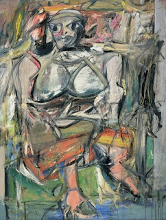
At first, when thinking about the self-generated project, I was a little lost on the concept I wanted to create. I proceeded to think about my final series project and decided I was going to use the concept of my final series for this project. It was a way to test out the size I wanted to do, and the mediums I wanted to use. I do not want to give away my whole concept for all those that are reading this, but it is along the lines of certain feelings that I endure due to an illness. I decided to test of the mediums of watercolor, marker, white-out paint, and soft pastel. I was influenced by the abstract expressionist movement artwork. 


https://www.metmuseum.org/toah/hd/abex/hd_abex.htm


This link that I attached really resonated with my concept and idea when I was research difference art movements to get inspiration. The point of my project of doing an abstract drawing was to capture the essence of my feelings which often times made me feel like I was living in a trance or not in a real world. Often times this was because episodes of my illness affect how I see things and the medication that I was on sometimes made me feel as if I was melting. 


Sunday, April 22, 2018

Self Generated Project


Sheridan Scifres

Professor Cindy
15 April 2018
Advanced Drawing
Self Generated Project

When I think of self-Generated I first thought of a drawing with no external influences, be it straight from consciousness, or in the mind. I was thinking abstract, very modern or expressionistic. At first I wanted to merge my love for sculpture with drawing by sculpting something onto the drawing, but then realized we had to sculpt, then draw. So this for me, was a VERY fun assignment because what I drew was also produced by me, and thus became very abstract, and weird, yet using regular shapes used in everyday settings: spheres and pyramids.
 
I started of this assignment thinking of geodes and quartz; things that are very earthy and raw, yet also look ‘out of this world’. Something very geometric and structural. I added the twist of adding the balls to break up the harshness of the straight lines. The sculpture I sculpted also reminded me of your typical punk, heavy metal person, spiky hair that looks more uncomfortable then it does cool type of hairstyle.

The first artist that came to mind was actually my ceramic professor Dave Kiddie! His sculptures are very geometrical, yet fluid, and contain a sense of movement within each piece. They are large and usually painted very vibrantly, and sometimes earthy. They look almost microscopic, as if a tiny cell was enlarged to be a thousand times its original size. The choice of color, sometimes bright and sometimes not, I think really ads to the piece. When they are all monochromatic with slight variations that firing glazes have, the effect it has on the sculpture is very interesting. It forces the viewer to look mainly at the shape, form, and surface of the sculpture, whereas the multicolored ones tend to straw away from that. The monochromatic color also emphasizes the repeating pattern that is often used in his sculptures. The form is repeated and thus the color, making them a very unified piece of work. Thus my sculpture, idea, and color were influenced by this artist because although my sculpture came straight from my head and not from an some macro image of a virus, or cell, it has qualities that lead to those type of connotations.

Another main influence for me was kinetic sculptures. Although my drawing is not kinetic by any means; the sculpture and form have that kinetic quality being that they seem to have a sense of movement and repeated pattern that continues on past the boundaries of the paper. These examples are two of my favorites and I feel like I could stare at them for minutes at a time studying the movement and shape.


Lastly, is this cool artist named Bergdorf Goodman, who creates drawing, or sculptures, however the viewer wants to put it, out of tulle, a common fabric like material. His paintbrush is rather an iron, and the material he draws with is the tulle. The combination of such two non form of art making is quite spectacular, and here is an interview of him and his process.


Wednesday, April 18, 2018

Self Generated Project

For this self-generated project I decided to use a pyramid I made last semester in ceramics as my subject. I have always enjoyed making more geometric art and sculpture so when were finally assigned “The Slab Project” in ceramics, I couldn’t have been more excited. 

To add interest to my pyramid, I decided to make a series of cutouts in it. At the end of each cutout a small raised cube shape reminiscent of the base of the pyramid is placed. By doing this, I intended to create some sense of movement in the pyramid and make the viewer feel as if the small cube was making the cut out as part of its trail. In regard to glazing, I knew I wanted to make it all one color so the focus could be on the sculpture as a single unit. I did some research on pyramids and their textures and was surprised to read that when originally built, they were shiny (https://www.architecturaldigest.com/story/facts-never-knew-about-pyramids-of-giza). The idea of a shiny pyramid amused me. It made something typically thought of as dirty, ornate looking – similar to Sherrie Levine’s gold-platedreproduction of Duchamp’s urinal sculpture.
 
Since my original intention with my sculpture was to make something interesting and geometric, I took the same ideals into my production of a 2D version. For this I looked at various pieces of geometric art. I found one piece that created the feeling a pyramid shape through a series of simple lines  -- no crosshatching or shade, just a lot of lines. I decide to use the same mentality in my piece – no shading, just intricate line work.

When planning, I also began looking into other various pieces of geometric art. I explored optical illusions, various pieces of op art(http://www.theartstory.org/movement-op-art.htm#important_art_header), and the perspective and illusions of MC Escher http://www.mcescher.com). Just as Escher does, I wanted to make something that was interesting to look at; something the viewer’s eye wanted to travel around and explore. I briefly considered trying to construct some kind of optical illusion or something that conveyed a sense of movement reminiscent to the small cubes on the original pyramid, but decided to instead create a large perspective piece. Though we were not required to make a big drawing for this assignment, I knew I wanted to make this geometric piece larger because then the piece would take up more of the viewers field of sight and cause them to get more immersed in the lines (I know I myself got a bit lost in all the lines when drawing it).


For color, I chose something subtle and similar to the glaze of the original pyramid sculpture. After completing all the line work, I briefly considered just leaving the black lines on the white paper, but felt that the cutouts in the pyramid got too lost in all the times and needed some color to help emphasize them. Watercolor was the clear option for creating a ceramic glaze like look. Just how I made the glaze of the pyramid a single color in order to establish the sculpture as a single unit, I knew I wanted to make the coloring of the entire piece relatively even and consistent so as to not distract from the complex line work (aside from a slight shadowing in the “cutouts” to separate them from the rest of the pyramid). 

Self Generated Project

For my self generate art, I was lost on what to do. I wasn't sure what I wanted to sculpt and I wanted to utilize my ceramic class. Then, when one of our assignment was to create a mold. I was really excited since I was making a mold of my bunny character I created since high school. After my mold came out, I wanted to draw something I was interested in and continue to add to this body of work. I have done multiple various of this piece and experiment with utilizing a similar style from the alter ego project.

I wanted to experiment with playing with line work and use of color to see if it was working so that I could use this towards my final project. For the self generate, I played with design work of line through straight, wave, circle and creating intricate pattern. I decided to draw an army of them since every time I have done these bunnies, I have always made an army. In term of character design, I was looking at ways to explore design but still trying to pay homage to my original character design. The purple bunny is purple with a patch, similar to my original design. I wanted always inspire by horror design so I was really into making the bunny cover in eyes.

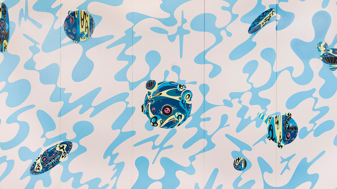
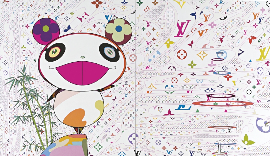
In term of creating the background, I looked towards Takashi Murakami works. He is a Japanese contemporary artist and works in fine arts media as well as commercial media and is known for blurring the line between high and low arts. I myself am very inspire by Japanese art and try to create this work to be more commercial.
Image result for takashi murakamiImage result for takashi murakami louis

I am also very interested in this body fluid abstract movement and is a repeating pattern in my work and helped influence the background elements. 


Since I put a lot of detail and attention to the bunnies, I wanted the background to be a solid bright color that would push the work to the foreground. I wanted to make it look like a poster design print. 

Also found this artist on instagram @camilladerrico and her drip works and movement wrapping the body.

Here are some designs I looked at that inspire my bunny:
Image result for camo      Image result for multiple eyes on face

I also didn't realize till after finished that my blue bunny reminds me a lot of the doll from Lilo and Stitch.
Image result for lilo and stitch doll

I was also looking at character design from Dunny - Kidrobot. I didn't realize how similar these were till after I made my bunny.
Image result for dunny vinyl

My bunny designs:


Self Generated

Self Generated


A self Generated is a work of art depicting mostly inanimate subject matter, typically commonplace objects which are either natural (food, flowers, dead animals, plants, rocks, shells, etc.) or man-made (drinking glasses, books, vases, jewelry, coins, pipes, etc.).
Still, life occupied the lowest rung of the hierarchy of genres but has been extremely popular with buyers. As well as the independent still-life subject, still-life painting encompasses other types of painting with prominent still-life elements, usually symbolic, and "images that rely on a multitude of still-life elements ostensibly to reproduce a 'slice of life'."The trompe-l'œil painting, which intends to deceive the viewer into thinking the scene is real, is a specialized type of still life, usually showing inanimate and relatively flat objects
Over the centuries artists have chosen the subject of still life for a variety of reasons: to reflect the status of their owner, be it humble or haughty; for their symbolic meaning which reveals a hidden story or idea; to capture the natural beauty of transient object like a flower or fruit; to demonstrate the artist's skilled painting technique; or as a controlled structure to express the abstract qualities of the visual elements.
Traditionally, still, life is the drawing and painting of items such as fruit, flowers and household objects, which are usually arranged on a table top.
For this project, I took a picture of objects in my house, and I started to draw it. I chose watercolor and acrylic color. I don't usually paint with watercolor, but I decided to use it in this project because it will fit more than another medium for this drawing.  


1- Juan Sánchez Cotán
Sánchez Cotán established the prototype of the Spanish still life, called a bodegón, composed mainly of vegetables. Characteristically, he depicts a few simple fruits or vegetables, some of which hang from a fine string at different levels while others sit on a ledge or window. The forms stand out with an almost geometric clarity against a dark background. This orchestration of still life in direct sunlight against impenetrable darkness is the hallmark of early Spanish still life painting. Each form is scrutinized with such intensity that the pictures take on a mystical quality, and the reality of things is intensified to the degree that no other seventeenth-century painter would surpass.


2- Georg Flegel 
Flegel was born in Olmütz (Olomouc), Moravia. Around 1580 he moved to Vienna, where he became an assistant to Lucas van Valckenborch I, a painter and draughtsman. Flegel and his employer later moved to Frankfurt, which at the time was an important art-dealing city. As an assistant, he inserted items such as fruit, flowers, and table utensils into Valckenborch's works.


3- Ambrosius Bosschaert 
He was born in Antwerp, where he started his career, but he spent most of it in Middelburg (1587-1613), where he moved with his family because of the threat of religious persecution. He specialized in painting still lifes with flowers, which he signed with the monogram AB (the B in the A) At the age of twenty-one, he joined the city's Guild of Saint Luke and later became dean. Not long after, Bosschaert had married and established himself as a leading figure in the fashionable floral painting genre.


These painters bring life to the most inanimate objects, using intense color palettes and great skill. Still life artists often placed religious symbolism within their artwork, which for the most part can't be seen at first glance. These famous still life artists are best known for their work with inanimate objects and have great skill in turning an ordinary scene into a still life masterpiece.
Still life painters are known to play with the composition of objects and negative space to develop certain looks to their work. While early still life work usually had religious themes and tones, some modern still life artists break the two-dimensional boundary and add graphic elements to their work. 


https://www.britannica.com/biography/Juan-Sanchez-Cotan

https://www.metmuseum.org/art/collection/search/436305

https://www.christies.com/SaleLanding/index.aspx?intsaleid=27466&lid=1&saletitle=&cid=em_sem%7cacct:christiesoldmasters%7ccmp:classicny0418liveclassicweeknyapr18genus%7cag:artistseveninggeneralexact%7cengine:google%7cnt:search%7crg:us%7cbanner:%7cimg:%7ckw:ambrosius%20bosschaert%7cmt:e%7csid:classicny0418?rnd=1