Tuesday, March 31, 2020

Mixed Media Project

Olivia Collins
Cindy Rehm
Advanced Drawing
March 31, 2020

My intention for this series was to create 12 pieces that would depict female hysteria. Female hysteria has been a subject for many male artists since the phrase was popularized in the Victorian era. Men have described women showing any emotion or distraughtness as hysteria when this one word does not capture any feelings or conditions of women. My found images are all stills from films directed by italian filmmakers Mario Bava and Dario Argento. Italian horror films from the 1960s and 70s have a distinct color scheme and aesthetic that is artificial and bizarre which I felt would make for more interesting pieces rather using images from the entirety of the horror genre. Horror, more than any genre of films, focuses on female hysteria since the majority of the women in these films are used to being dramatic characters. The women characters are often seen overreacting and the victims of murders and other horrible acts. I was also interested in surrealist artists since these two directors were influenced by this period of art. I was thinking about Dali’s piece The Phenomenon of Ecstasy (1933) where he depicts a collage of women having faces of sexual climax, which was also considered a form of hysteria. I wanted my series to focus more on the emotion of fear and panic. As far as the look of the print pieces, I wanted to keep them as overwhelming accents for the movie stills to be on. I wanted the characters to look as if they were being taken over by the chaotic background. I was somewhat influenced by painter Laura Owens for the scribbled backgrounds, especially when I chose to cut out certain marks to highlight. 
The films referenced in my series: 
Black Sabbath (1963), Mario Bava 
Blood and Black Lace (1964), Mario Bava 
Kill Baby, Kill (1966), Mario Bava 
Lisa and the Devil (1973), Mario Bava 
Deep Red (1975), Dario Argento 
Suspiria (1977), Dario Argento  
Inferno (1980), Dario Argento 
Tenebrae (1982), Dario Argento


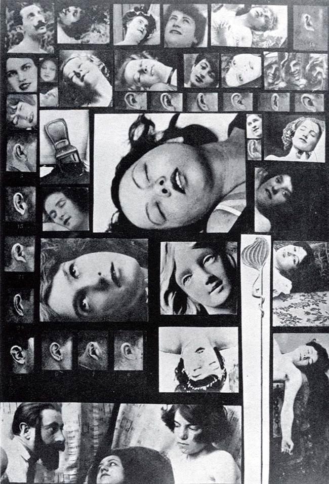
Salvador Dali The Phenomenon of Ecstasy (1933)

Laura Owens


Monday, March 30, 2020

Mixed Media Project


Niki Ravari
ART 318

This assignment introduced me to new mediums as well as new artists who inspired the way I used materials. The first artist I wanted to talk about is Kara Walker. Kara Walker is a painter and collage artist whose works generally shed light on important topics, primarily about race and gender. Something that stood out to me about her collaging work is the way she uses historic pages as the base for the works and uses them as key factors in the piece. This inspired the base for my pieces which are pages from a book titled The Capitol. This book reported on music and entertainment news from 1948 and while I knew it would be unrelated to the rest of the subject matter, I chose to use it because I liked the idea of incorporating images that would not normally make sense together. The images I’ve included in my collection of works are generally relating to the popular beauty standards of women overtime, such as images from well-known magazine covers and vintage beauty ads, which I then altered to remove them from their intended surroundings which creates a new image that seems arbitrary.

Kara Walker:


The next artist is John Brendan Guinan, who is known for his paintings using mixed media which contain an abundance of textures and vivid colors. Each of his paintings are layered and complex, making me wonder what steps he took to create his works. I particularly like the pieces which incorporate what look like doodles from a sketchbook, with raw edges of the paper attached to the base. This added to the theme I wanted to explore of using shapes and images that don’t necessarily make sense. Guinan’s use of color inspired me to think about strategic ways to incorporate colors in a way that would be visually pleasing. Creating relatively random shapes and piecing them together in the most strategic way became the most enjoyable part of this project for me.

John Brendan Guinan:

Pieces from my project:

Saturday, March 28, 2020

Mixed-Media Series - O'Toole

Elizabeth O’Toole
Professor Rehm
Advanced Drawing
30 March 2020
Mixed-Media Series: Escaping Preconceptions
            Upon the start of formulating a concept behind my mixed-media series, a general theme developed fairly organically as my research gravitated towards a certain set of artists, aesthetics, and ideas. Much of my artwork and paintings focus on topics such as the female identity and form as well as how that identity fits and interacts within different constructs and expectations. Along with such ideas, I have always gravitated towards retro source photography and women’s interactions with the camera. As I began researching artists as a source of inspiration, a few different artists stood out to me for their similarities in substance and ideas.
            Firstly, I found inspiration in the work of Barbara Kruger and her use of black and white photography paired with bold statements in red. I think Barbara Kruger has always been a subconscious influence as I didn’t fully realize the similarities in aesthetics until much later in the development of my series. Her use of charged photos paired with bold linework and statements channel a similar energy to that which I aim to express in my series. Another artist whose work served as a source of inspiration was that of artist Lorna Simpson who explores ideas of race and gender through her work. I was particularly inspired by her 1989 series, Easy for Who to Say, where she erases the face from female portraits replacing it with a vowel with a given meaning. This commentary of women being told, viewed, and given certain expectations and constructs is another concept I wanted to explore.
            My series includes 12 black and white pieces using print, photography, painting, and collage to express feminist ideas surrounding the views and pressures of women throughout history and today while also considering the idea of the “male gaze.” While I think it is fair to allow viewers the liberty to interpret any series or artwork as they wish, I merely wish to explain ideas I contemplated while creating this series. Along with using a variety of black and white photography and imagery, I chose to obscure the vision of each subject in my series in one form or another often striking these women’s eyes with red paint to exemplify the ways their own views are often taken away from them or made less significant in a society dominated by the male heterosexual perspective. While I was inspired by retro photography and source imagery, it is also indicative of the ways women have been oppressed throughout history even before any of these photos were taken. With their vision obscured and emotions ambiguous, it brings up the question of who is taking the photograph and the outsider’s perspective on how she looks. I also specifically chose photography of women in motion, often running or moving, trying to escape these preconceptions of how they are to be and act. With my layering of paint and linework, I hope to emphasize motion and tension as the women photographed work to release themselves from these imposed constructs. 

Wednesday, March 11, 2020

Collection Blog Post

I don’t have a lot of memories from when I was a kid, so I especially don’t remember what I used to collect besides the basics. If I passed by a rock that I liked, I would pick it up. If I noticed that I didn’t have a quarter with a certain state on the back of it, I would keep it in a jar. You want Build-a-bears? I had 20. Silly Bandz were the top thing in 2010, so they covered my wrists. As I got older and edgier, I had drawers full of band t-shirts and bracelets. While being an athlete, I would buy a t-shirt and at least three hair bows from each tournament that I went to.
I had so much trouble deciding what to collect for this project. Procrastination was definitely my middle name. It wasn’t until I was looking through my jewelry box I noticed a little bowl that I had that was full of tags from clothes that I had bought and decided to keep. I didn’t even notice that I was collecting them. I started to do this during the summer because I worked in retail and would constantly purchase items from my department ( that’s how they get you). My work had a great return policy, so even if I didn’t have my receipt or tag with me, they could find my proof of purchase and return it no matter what. However, I would keep the tags anyways. I still had tags from clothing in my closet, and I had made some purchase orders that were going to arrive soon, and so I decided to add those to what I already had.
I decided to arrange my clothing tags the way that I did because I noticed that there were a couple and sometimes multiple of the same tags from the same brands. I also decided to arrange them from a more random geometric shape to rectangular. Rather than putting them on a pedestal, I wanted to display them on the wall because tags are hung on clothes, so I wanted them to be hung on the wall.


Lilly Stene- Collection Blog Post

I’ve always been collecting things since I was a child. I would collect mainly dolls and stuffed animals, especially Webkinz. I would display my favorite ones on my bed, and I had a huge plastic bin for the ones that I didn’t play with as much, but was too attached to to give away. As I got older, I began collecting rocks because my family and I would go to the north shore to Minnesota for hiking and swimming. These shores contained many unique rocks and shells, and tiny shops around the shores would sell polished versions of them that I would collect as well. As I got older and moved to California for college, I began collecting rocks sold in various shops around the beach, and shells on the shore. I went to the beach last weekend to find some more shells to display as well. I chose to display this collection because it is something that contains objects that I began collection in highschool, combined with the unique shells that I collected for this project. I display this collection on my windowsill in my apartment, mixed with my collection of succulents. I decided to display this collection organized by color and size, so that it would still look visually aesthetic, even though the rocks have unique patterns from one another, and the shells obviously look very different than the rocks. 

Collection Project - Olivia Collins

Olivia Collins 
Cindy Rehm 
Advanced Drawing 
March 11, 2020
Collection Project 
I have always been collecting various things throughout my child. If there was a certain brand I liked I wanted to try to keep many items of that particular thing, such as Hello Kitty, Harajuku Girls, and Betsey Johnson. I was definitely drawn to very “girly” things when collecting and lots of kitsch. As I have grown older the idea of collecting is something that is still important to me. My dad has been a collector for my entire life, I was always surrounded by his collections of thousands of books, CDs, vinyls and magazines. I have a lot of sentimental value and nostalgia in many of the things I collect. I keep movie theater tickets, going to the cinema is the best pastime in my hometown so keeping the tickets has always been a good way to remember where I was on certain days. Going to concerts and gigs is another thing that has always been very important to me so I collect band shirts. My collections mainly consist of keepsakes from a particular experience which is why they will always remain so special. 
My collection for class is a combination of tickets of events I have been to since 2016. About half of this collection is movie theater tickets and the other half is tickets to museums and other cultural institutions when I lived abroad in France. There are other types of tickets mixed in such as concert tickets, very few of the shows I have been to have given a physical ticket, since everything is digital, but when they have I have kept them. I am interested in displaying them on the white wall salon style to show the difference in the actual tickets but also to show something that many disregard as potential art. I chose to keep them in order because it is a literal timeline of where I was throughout the last four years. I wanted this collection to be shown compared to some of my others because it is forever still in the progress and added too.


Collection Project


Niki Ravari
ART 318

When I was younger, there were a few different objects I would collect. While most of these collections were of invaluable items, one collection I had for several years of my childhood had great significance to me. This collection consisted of a variety of stuffed animals called Webkinz. These were stuffed animals that came with a code which allowed you to log in online and see digitized versions of each stuffed animal. My collection was displayed on three long rows of shelves and consisted of around twenty Webkinz.


This childhood collection was what prompted my idea for this project, leading me to the decision to collect teddy bears. When attaining this collection, there was one general rule that I kept in mind: the teddy bears must have been previously owned. It was important to me to acquire used teddy bears because I felt that they emanate their history, and more so, the mystery of the stories behind the objects. I was able to find most of my collection at various yard sales throughout Orange. This turned out being the most enjoyable way of collecting them because it gave me a bit of insight on where the objects have been. In addition, I picked up a few teddy bears from second hand stores as well as from friends who were ready to let go of their childhood friends.


For critique, I will present my collection by pinning the teddy bears to the wall in a way that portrays the idea that they were no longer existing for their initial purposes. They will be dispersed on the wall in a disorganized manner which will emphasize a lack of attention during the installation process reflecting the idea of abandonment that these objects have experienced.


Josie Tiffany: Collection Project


ART 318:  Advanced Drawing

Collection Project

Josie Tiffany
3.11.2020


Speak about your past experiences with collecting.  Discuss the process you used to develop your collection project.  Why did you choose these pieces? How did you arrange your objects and images for critique?  Include 3-5 images of your collection?

Collecting has always been a hobby of my dad’s, or rather a hoarding obsession.  However, the collection has its ups and downs in terms of sentimental value. For instance, when I was in middle school, my dad showed me a box that contained objects that represented important historical moments during my lifetime.  What included was a New York Times paper clipping of the 9/11 attack, Bush became president, the US engagement in Iraq, the space shuttle crash that killed 7 astronauts, and more. The purpose of this collection was to share the mementos and the physical memories that were consistent in my timeline.  From there, it not only felt like a responsibility but rather a continuation of my own existence that was manifested into a tiny, cedar box.  But sometimes, collections can easily go into disarray by their creator when they are created with no sentimental value, but rather a sense of obsession and need.  An example is my father collecting all the small things from my childhood. While it may sound sweet at first as he can recollect the nostalgia of that moment, it is replaced by his obsession of not wanting to throw anything away.  For instance, we still have a foam bowling ball pin from George Jackson’s first grade birthday that’s chewed up from my dog, the half dismembered body parts of barbie from my 3rd grade birthday cake topper, some toy ATM machine that cannot function anymore even with a battery, and more.  Such things would not be called a collection as there is no organization and an absence of feeling towards those objects.

For my specific piece, I choose tea bags as they are frequently objects that are thrown away after they have served their purpose of satisfying their consumer.  Therefore, I wanted to create a collection that demonstrates the ironic twist of keeping an object that has “lost its purpose” or deemed “unusable”. By putting it in a collection, it challenges the thought of whether there is inherent meaning to the subject and possibly changing the perspective of that individual.  Therefore, I want to challenge the audience on their perception of “the forgotten vs. the present”, “the disposable vs the timeless”, and “invaluable vs valuable”. I hope to arrange them in a sophisticated fashion that juxtaposes the action of throwing them away without a second thought. Thus, a linear fashion would be my preference in displaying the collection.


Collection Project

Zane Vieira
Art 318 - 01
Collection Project
My Camera Collection When I think about past collections I’ve had, it has never truly been anything
specific it's actually mostly been junk. Like most children, I collected rocks that I thought were
interesting, but they were even more interesting to me due to the fact that my grandfather was sort
of an archaeologist. We would go on “rock hunts” and search for whatever was supposed to be
prominent in the area, then he would polish and shape what we found for literal “rock shows” where
other people would present their findings as in a competition like fashion. Although, most of the stuff
that I wound up collecting as a kid was mainly garbage or things I thought were interesting. Most of
these items were often electrical parts, old mother boards from computers, and various types of
wiring. I wanted to use these elements to make props for short films I made when I was a
preteen, but most of these items went unused. It wasn’t until I was gifted the same grandfather’s
old film camera, the Nikon EM, that I truly began to be interested in old cameras.

It was amazing to me that it still worked, and it produced images that were even better than any
digital camera I’ve seen. From there, I began to slowly amass a small collection of cameras, most
of which didn’t work. It was cool at first, but I soon thought that it was pretty pointless to be collecting
what was basically junk since it couldn’t operate and produce any images. Not to mention, the
cameras I did have that worked cost a fortune to use, since each roll of film was nearly $20 to
develop, which was money I didn’t have. It wasn’t until fairly recently, that my film camera collection
had a resurgence when I began developing my own film, which made shooting film, while still costly,
much more affordable. It’s now my goal to collect cameras that fully function and can produce
images, even if that means I have to repair them myself. I’m choosing to arrange my collection by
camera type(format, function) and roughly the year they came out to broaden an understanding of
where technology was at the time, and how little it has actually changed. 


Collection Project-Maddy Cartwright


     In the past, my experience with collecting has been somewhat limited. I have always picked up sea glass and agates off of the beach, but I have never taken the process of collecting very seriously. In deciding on my project, I chose to use photography as my medium, specifically a disposable film camera. I decided to take a photo during moments that I felt truly happy, and then analyze the contents of the roll of film to figure out what makes me the happiest. Having struggled with depression since 7th grade, taking a moment to appreciate the times that I feel a serotonin boost is an extremely important step towards the healing process. I have been doing this for a while as a way of practicing mindfulness and after I snap each photo, I take a moment to myself to appreciate the way that I am feeling. We all dwell on sad memories, but it takes some training to be able to comfortably dwell on cheerful moments. The use of a disposable camera also prevented me from being too wrapped up in the photography process as I usually didn't get to see the photo until a month later. Disposable cameras are a tricky medium, so some did not turn out recognizably enough to be included in my collection, but the photos that I chose are the photos that best represent my own happiness. In analyzing the photos afterward, I decided to group them in order of how many people were with me when I took the photo. As someone who has always been a self-proclaimed introvert, I was surprised at how many of the photos were with a group of people. I decided to space the photos in which I am alone slightly farther away from the rest of the photos to further emphasize the difference in how many happy moments I had while I was alone versus with other people. 

Collection Project Elizabeth O'Toole

Elizabeth O’Toole
Professor Cindy Rehm
Advanced Drawing 
11 March 2020

A Collection of Green: And what does it mean?

            When embarking upon this project, my mind went to one place: color. I kept trying time and time again to stray from what I felt was too familiar or ordinary, but I kept coming back to the same desire to investigate collections of color. This further put me on the path towards questioning, what about color? What is it about a varying collection of dissimilar, yet unified items that I am so drawn to? And upon giving the collection more thought, I couldn’t escape the desire to create a collection of green. Now when I think about typical childhood collections, my mind usually goes to objects like dolls or marbles, maybe even baseball cards or bracelets, but approaching this topic from a young adult’s perspective, my mind went somewhere else. What was it about the color green that I was so intently focused on investigating. I think it wasn’t until some time passed and my collection began growing that I started realizing that I wasn’t just in search of a color, but a feeling, an idea, a statement.
            I wanted to explore green because I wanted to understand how it made me feel and how it is typically used and felt by others. Narrowing in on items and objects that are green made me realize what color can feel like and in a greater sense, what it can stand for. When we think about certain colors, we might instantly tie them to ideas. Pink, for example, is often associated with womanhood, softness, femininity, flowers, etc. Whether or not we choose, years and years of history, art, and advertising have contributed greatly to the ways we see and interpret color.
            I chose to collect green items, because there is a certain degree of ambiguity that comes along with green. At its most basic surface interpretation, when we see green we think of trees, nature, maybe we think, “GO” like a green traffic light, or jealousy; maybe even money or greed. But what I began to discover was that for me, it represented much more complexity. When I started collecting items, certain themes and ideas became apparent: contradiction, growth, and artificiality. Now I do not mean to say that these are the ultimate three or sole associations, but merely the concepts I wish to develop through this collection. Above all, I want to call to light the duality between real and artificial. When I think about green, and I look at my collection of items, I cannot help but think about certain opposing forces. Real versus artificial. Organic versus inorganic. Growth versus death. Natural versus chemical. Beauty versus utility. These among other ideas can be seen through the conflicting items present in my collection. As I kept searching for items that best fit, I noticed the way green is used to express certain ideas. It is used on the packaging of cleaning materials, kitchen supplies, and advertisements, often commanding the idea of growth, strength, and cleanliness. It takes on a certain commanding presence, but without the same volume or intensity of bolder colors like red or even black. Although it represents that which is natural and organic, it is often exploited to trick viewers and consumers into seeing the artificial and false in that same light. And while it is often tied to positive connotations of growth and action, it can also trace back to ideas of jealousy and falsehoods depending on the context and the viewer. Through this collection, I hope to share these ideas and contradictions associated with the color, green. By including fresh produce next to tools and chemicals, along with both plants and plastics, I hope to make known or at least make viewers take a second to reflect on feeling green and what colors mean to them. 

Tuesday, March 10, 2020

Collection Project

Growing up, I remember having somewhat of a fascination with large quantities of things.
Something about the sheer number of stars in the sky, or pebbles on the beach, or fans at
a baseball game made my mind bend. I was drawn to the unfathomable intangibility of
quantities too large to wrap my brain around. In hindsight, I believe that this fascination is
what motivated my numerous collections as a child. Bordering on obsession, these collections
were not prompted by any affection or sentimentality for the objects that I was collecting, but
rather by the concept of having mass quantities to call my own. Simultaneously fueling my
desire to collect was an unhealthy dose of competitiveness. So when I saw that a girl in my
class had collected a small handful of colored pencil tips, I filled an entire mason jar with them.
I collected animal erasers, beanie babies, barbies, and even kept the wax from babybel cheeses
and formed them into a giant wax ball. To reiterate, I felt no particular affinity towards erasers or
stuffed animals or cheese wax, but rather towards the act of collecting. 
I have since outgrown that strange proclivity, but the satisfaction of acquiring a collection remains.
In my adult years, I have found more subtle outlets for my tendencies: my extensive bookshelf, my
cluster of candles, my table of perfume bottles. None of these collections seem over the top or out
of place in my maximalist bedroom, but they nonetheless are homages to my upbringing as a collector.
When this collection assignment was introduced, I was bombarded with a deluge of ideas, of collections
I could expand upon or entirely new ones I could begin. 
On the coffee table in my bedroom, I had three Playboy magazines from the 1970s gifted to me by a
family friend from her own collection of archival magazines. I personally find the brand and the company’s
history incredibly fascinating. I’ve found that flipping through the magazines provides an insightful look at
the progression of female sexuality through the male gaze. Observing the constantly evolving beauty
standards reminds me of how subjective attractiveness is, and how it is so often dictated less by personal
desires and more by societal norms of a given time. I decided to expand upon my collection of vintage
Playboys in order to obtain a more comprehensive look at the evolution of what was subjectively considered
sexually desirable. 

The magazines that I chose to include span the 60s, 70s, and 80s. I decided to focus on these decades
in order to exhibit how rapidly aesthetic standards and sexual expression evolves within a relatively
short period of time. I acquired the magazines from a variety of sources, including vintage thrift stores,
etsy, and borrowing from friends. For my display, I want to emphasize two diametrically opposed movements
of the mid-20th century: the sexual revolution and conservative family values. I decided to play against the
taboo nature of the magazines by displaying them in an environment reminiscent of a wholesome 1950s family
picnic.