Monday, April 29, 2019
Transmogrifier Project
Overall, I think our class did an amazing job with the Transmogrifier project. When we all walked in, there were materials organized by category on all of the tables. This setup was extremely useful and organized, and made it much easier to navigate around the room. We put the door up and had two items already from people who could not make it. Each item was carefully crafted by 2-3 students working together to recreate what they saw from the items available. The flow of items were really slow at first, but Sammy and Jackson went out and recruited so many people to come! At one point, there were at least 5 items waiting to be created! The process of combining our ideas with those of our classmates and using only what we had in front of us was very challenging, but I think all of us found it super fun. This project reminded me of Jeff Koons' balloon animal sculpture because he took such a useless, bland object and recreated it with a different material on a very different scale. His sculpture is larger than life, whereas a balloon animal is usually able to fit in one's hand. A lot of us experimented with changing the scale of these objects, especially if they were really big (e.g. the huge tree leaf). I think the whole process was really smooth and the class did a great job of collaborating and on different pieces and allowing for everyone to work on several different items. We were all very proud of our creations and the reactions from the people receiving their items made it worth it. I think we can all agree that we liked this project!
Tuesday, April 23, 2019
Destruction Project
Ali Sykes
ART 318-Advanced Drawing
Destruction Blog Post
I
pondered over what to do for this project for a really long time. It was really
strange to me to think about destroying my artwork, and then having that
destruction become art itself. After sifting through the pieces I made this
semester, trying to decide which one would be best for my project, I kept
coming back to my figure drawing pieces. I began thinking a lot about the act
of drawing a body, and the act of drawing with
a body, and felt there was a really interesting relationship between those two
ideas.
As
I began researching, I came across a few different artists that use their
bodies instead of paintbrushes as a method of creating artwork. The first
artist that caught my eye was Alexa Meade, who creates beautiful and detailed
pieces by painting her actual subjects, models and backgrounds, and then takes
photos of the scene. I thought this was a very interesting and unique concept
that definitely embodied my idea of drawing with the body. The second artist I
came across was Tony Orrico, who is a performance artist with a dance
background. I was specifically inspired by Orrico’s Penwald drawings, in which
he performs for hours as the human equivalent of a drawing machine transcribing
circular arcs with his outstretched limbs, each mark varying with density
depending on his exhaustion. Finally, the artist I found most influential is
Heather Hansen, who is also a performance artist with a background in dance.
She creates large scale charcoal paintings with movements utilizing her entire
body. While her pieces do not visually depict an image of the human body, they
are still representative of it because they capture the movement and energy of
the body. I liked this idea a lot, and wanted to convey this same idea in my
own piece.
So,
when it came time for me to create my own piece, or rather, destroy it, I
already knew I wanted to use a figure drawing piece and I already knew that I
wanted to incorporate documentation of my body movements. I chose my final
figure drawing piece because it felt the most complete and finalized out of all
of my pieces, due to the fact that it is not gestural and contains value and
props. It didn’t feel like just a sketch, but rather a piece of work that was
capable of being changed with destruction in order to give it meaning. For the
mutation, I chose to cover my body in primary colored acrylic paint. I chose
the primary colors because those were the only colors I used in the original
piece, so I felt that the piece would have more continuity in theory if the
colors carried over (even though you can’t see much of the original piece
through the paint). I chose to use acrylic paint because it would be the
easiest method for me to cover my body and transfer colored pigment onto the
piece; but also because I wanted a level of opacity where the mutation wasn’t
just adding something to a piece that was already made, rather, it was
transforming it into something else. To create this piece, I essentially just
rolled around on it while covered in paint, doing different motions and
movements, basically just whatever felt natural. I really like the idea of
using movements of the body over top of an image of a body, showing this other
way to represent the human body in art.
Process
Images
By Alexa Meade
"Loving Care" by Lilibeth Cuenca Rasmussen
Penwald drawings by Tony Orrico
Unknown Artist
Drawninward by Heather Hansen
Sources
Article about different painting methods, such as with the
body: https://www.studentartguide.com/articles/inventive-mixed-media-techniques
Blog about Heather Hansen:
Mail Art
When I first learned about the mail art project I was curious about why go through the process of physically sending the art in the mail when you could just hand the pieces to your classmates. However, I was excited to receive art from my talented peers and send out my own work. I wanted my pieces to be quality for them and unique. I was inspired by a previous mail art assignment where a student made each piece dedicated to a positive female role-model. I wanted to bring attention to people I admire that are mostly unknown, and a few others. Because I am very passionate about music and LGBT+ representation, I decided to make each piece dedicated to an artist that is a part of the LGBT+ community. Additionally, most of the songs I chose have openly LGBT+ lyrics or music videos. For example, Kesha's music video for her cover of I Need A Woman To Love, has her officiating a wedding of two woman and Pray It Away by Alex G is about going through coming to terms with your sexuality and religion. I made sure that everyone had a music video so it would be like everyone got an equal amount of art. I tried to cater who got what song by what I know of their music taste but I also felt confident in the quality and universal likability of each song that I left around half of them up to chance. I drew the pieces in my own 2D portrait style. 2D portraits have been something I have wanted to practice so this was the perfect opportunity for that. I wanted to put focus on the artists so I decided the pieces should have white backgrounds. I simply added the song title to the right and the artist's name beneath it. I spent a while on these pieces. When there wasn't the right marker color in the art classroom I would put the piece aside until I was able to get a more accurate color for the hair/skin/etc. I also redid one of the pieces so it would match the others when the lines became too thick when I tried covering up a mistake.
I understood the mail aspect of the project once I started receiving pieces in the mail. It was exciting having something to look forward to getting but also not getting all the pieces at the same time and not being sure when each piece would arrive.
Destruction Project
I use to be extremely attached to my work and have had trouble giving it away. The older I get, the easier it is to give away my work. Maybe it is because I have more work than before or because I realize that it deserves a greater life than just sitting in a folder. However, this project did not call for giving away work. It called for destroying it. The thing is, those concepts are not as indifferent as they first seem, as both change your relationship with the piece if release/destruction was not your intent at the start of its creation.
I knew going into this project that I wanted to use the huge black and white charcoal piece I had from the architecture-related project that I did for this class as the base. This is because:
1. huge, meaning I had space to include a lot of work
2. I did not see it having a future being displayed
3. Even though I eventually liked the piece, I did personally care for it
4. I saw a ton of potential in the piece with adding color
In addition to my untitled black and white piece, I wanted to use some of my figure drawing that was hiding away in a folder.
Starting this project, I did not view it so much as destroying work but instead as giving the pieces away to each-other. So, I moved my carpet, pushed back my couch, and threw about a dozen pieces onto the floor. I organized them into sections based on style and removed a half of them, that either I was not ready to "destroy" or were not black and white. I wanted to start the piece off by adding black and white figure drawing to the base and then adding color. The first piece I started cutting never made it into the work but I easily made terms with it, especially since I took pictures of most of the work before cutting.
I say but always sleepy, but while working on this I reach the perfect amount of sleepiness, that let me move past any inhibitions and follow my instincts. The first addition was the man with a hat and then I wanted the other man with the same pale-looking skin to touch feet with him. It felt to me like a weird sign of connection. I thought it would be important to use newer pieces as well to challenge my relationship with my own work. So, I cut up my two newest figure drawings. Then cut then up some more. The cutting was inspired by how abstract the background was. I wanted to keep the piece abstract from the start. Furthermore, at this point, I settled on a limited color scheme. Then, I cut up one more piece which included two drawings of a woman.
It became a natural moving process of college. I just kept arranging the pieces in whichever way felt justified to them and interlacing their essence, as this piece is about connection. I wanted the piece to be eye-catching and intriguing. This led to piece to be able to be interpreted as sexual in nature since "sex sells". I have no problem with this reading, and it when it comes down to it, this piece is an intercourse of art. In some of my pieces I have a set interpretation I prefer the readers to see even if it is not obvious, but at the moment for this one, I don't feel as strongly about the audience's interpretation.
I really enjoyed making this piece. When I first learned about this piece at the start of the semester, I was scared about it and destroying work, but it came at the perfect time when I was ready to take on that challenge. I am more than satisfied with the outcome and feel that these pieces became stronger together.


 |
| Yes, I was standing on the couch's arm rest for this picture. |
Mail Art
For the mail art, I will say I got my main inspiration from a piece I saw in class. I didn't know what I was going to do, but I wanted it to be as personalized and random as I possibly could have it. So, I drew a drawing on the front and wrote an off-the-cuff poem on the back. Then, I numbered the addresses and the cards 1-11 and put everything through a number randomizer!
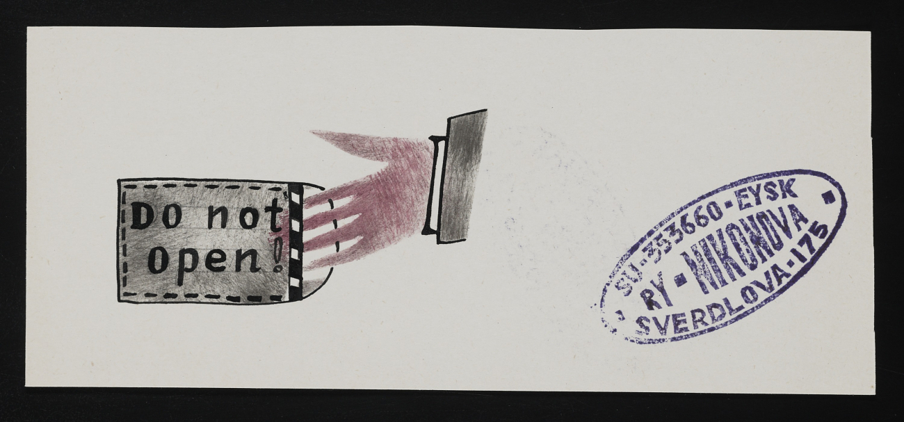
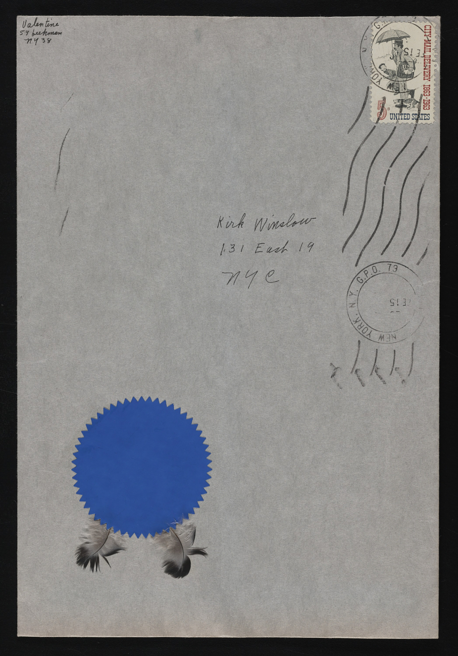
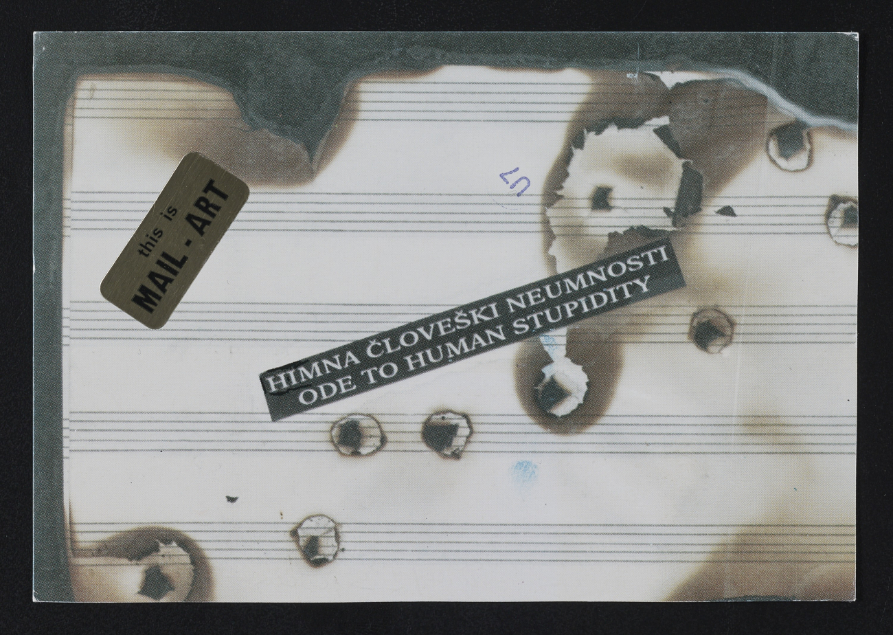
Researching other artists who practiced mail art was interesting as well. Ray Johnson as a person fascinated me. I loved learning about his work in class and learning about how interesting a human being he was and how that was reflected in the work. Another artist that was amazing and inspiring was Ruth Wold-Rehfeldt. She is a German artist that has been practicing since the 70s and 90s. Hor work consists of typewriter art and poetry, which I found really tied into my idea of a little poetic mantra. Ry Nikonova, another poet and artist, who was a powerful activist and a spearhead for the Transfurism movement while also founding the Uktuss School art movement in Russia. She participated in a lot of mail art, not only sending her own but participating in group projects as well. She joined the movement in 1985. Her spouse, Serge Segay, was another prominent feature in both that Transfurism movement and a player in mail art as well. He organized the first mail art exhibition in the USSR in 1989 and, like his wife, participated in many mail art projects.
Mail art was an interesting experience. I was terrified- sending my work out. I was texting friends making sure they got it, panicked that it was lost or damaged. I even only send the photocopies of my work and not the actual original because I was so scared. I'm very sentimental, I keep every piece of art. I have doodles from elementary schools saved in a folder because I refuse to throw them away. This was one of those cases where I was so scared to get rid of these works. I didn't think I was going to get them back, and though I want the class to keep them it still scared me. I had a full meltdown, so stressed about where they were going to go. Would they be thrown away? Forgotten? Kept? I didn't know and that lack of control was an exciting feeling to explore. Dropping them in the mailbox was a heartwrenching day, I put them in one at a time (getting honked at from the guy behind me in the process) but it was like sending my babies off to college, they each got a goodbye. Either that or I am too emotionally attached to my art, but hopefully, this mail art thing helps push me out of my comfort zone.
RAY JOHNSON


RUTH WOLF-REINFELDT


RY NIKONOVA
SERGE SEGAY
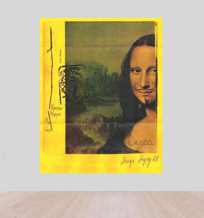
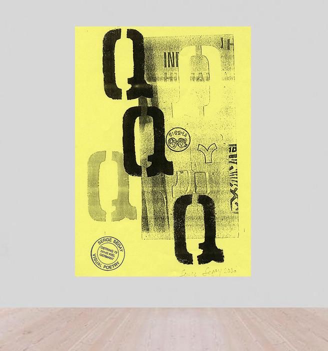

Researching other artists who practiced mail art was interesting as well. Ray Johnson as a person fascinated me. I loved learning about his work in class and learning about how interesting a human being he was and how that was reflected in the work. Another artist that was amazing and inspiring was Ruth Wold-Rehfeldt. She is a German artist that has been practicing since the 70s and 90s. Hor work consists of typewriter art and poetry, which I found really tied into my idea of a little poetic mantra. Ry Nikonova, another poet and artist, who was a powerful activist and a spearhead for the Transfurism movement while also founding the Uktuss School art movement in Russia. She participated in a lot of mail art, not only sending her own but participating in group projects as well. She joined the movement in 1985. Her spouse, Serge Segay, was another prominent feature in both that Transfurism movement and a player in mail art as well. He organized the first mail art exhibition in the USSR in 1989 and, like his wife, participated in many mail art projects.
Mail art was an interesting experience. I was terrified- sending my work out. I was texting friends making sure they got it, panicked that it was lost or damaged. I even only send the photocopies of my work and not the actual original because I was so scared. I'm very sentimental, I keep every piece of art. I have doodles from elementary schools saved in a folder because I refuse to throw them away. This was one of those cases where I was so scared to get rid of these works. I didn't think I was going to get them back, and though I want the class to keep them it still scared me. I had a full meltdown, so stressed about where they were going to go. Would they be thrown away? Forgotten? Kept? I didn't know and that lack of control was an exciting feeling to explore. Dropping them in the mailbox was a heartwrenching day, I put them in one at a time (getting honked at from the guy behind me in the process) but it was like sending my babies off to college, they each got a goodbye. Either that or I am too emotionally attached to my art, but hopefully, this mail art thing helps push me out of my comfort zone.
RAY JOHNSON


RUTH WOLF-REINFELDT
RY NIKONOVA


SERGE SEGAY


Monday, April 22, 2019
Destruction Project
Sammy Keane
18 April 2018
“Her”
For this project, I added paint and string to a life drawing that we had completed in class. The drawing
itself was done with pencil and watercolor on watercolor paper in subdued tones. At first, I was going
to destruct and alter two pieces of my work but once I began, I decided to focus on one more than the
other. My first thought was to have one of my works being right up and the other upside down. I was
going to stand on one side and do the same actions to both and notice the difference it would make for
the different drawings. I started with watered-down colored ink and began splatter painting the works
without looking. I was simply looking at the ink going onto my brush instead of what was happening on
the paper itself. Once I was finished with the ink, I noticed the blue paper was not holding the ink as well
as the watercolor paper and it was about then that I thought to focus on the white one instead.
After I did the ink splatter, I looked at the works and decided I wanted more vibrant and thinker colors
to be splattered across the life drawings. I chose colors such as pink, yellow, orange, and green to throw
on these works. Unlike the ink, I decided to keep these paints their natural consistency to provide the
most vibrant pigment and abstract outcome possible.
to be splattered across the life drawings. I chose colors such as pink, yellow, orange, and green to throw
on these works. Unlike the ink, I decided to keep these paints their natural consistency to provide the
most vibrant pigment and abstract outcome possible.
Lastly, I did not think the splatter work was enough so I decided to begin to sew 4” by 1” lines across
the white piece. There was really no thought in my mind prior to doing this except for the fact that I
have always wanted to incorporate string or yarn into my work and I thought that this would be a great
time to do so.
the white piece. There was really no thought in my mind prior to doing this except for the fact that I
have always wanted to incorporate string or yarn into my work and I thought that this would be a great
time to do so.
On the bottom left you can see the first count of string that I used on this piece. I ended up doing about
8 others using vertical and horizontal lines to add to the destruction of the prior piece. I found this project
to be very fun as it forced to work outside of my comfort zone and add aspects to a work that I had
before told myself was finished. Honestly, I like this new and fun version much better than the previous
plain ole life drawing.
For inspiration to the destruction of this work, I was looking at artists such as Jackson Pollock and Nike
Savvas. Jackson Pollock has great movement in his splatter works and I was trying to get that same
action in mine. Whereas Nike Savvas is very talented with string and color and I wanted to incorporate
both of those aspects into my piece.
Savvas. Jackson Pollock has great movement in his splatter works and I was trying to get that same
action in mine. Whereas Nike Savvas is very talented with string and color and I wanted to incorporate
both of those aspects into my piece.
Subscribe to:
Posts (Atom)


