Monday, April 8, 2019

Alter Ego Project

For this project, I wanted to continue with the similar aesthetic and message of my other works regarding body image, the rituals/time we put into our appearance, and societies expectations of how we should look. I used the same pink color scheme, and fine line drawings to convey my ideas. My drawings are digitally rendered to give them a more pristine and consistent look; this is key to my piece and the series which is slowly starting to emerge from the work I am producing this year. The color scheme is important too because it is one that is typically tied to feminine bodies throughout history. I wanted to go agist this as I spoke from a queer male gaze. The color helps me bring these ideas into the piece; as this is a self-portrait, conveying the queer aspect was especially important.

The piece which I titled “Reconstructed” is printed on a 16x20 piece of paper. On top of the illustrations that are printed, lay seven pieces of plastic that are then traced upon. The tracing resembles the part of my body that I would like to change, alter, or wish that would naturally be different. These include my eyebrows, lips, jawline, nose, arms, abdomen, and legs. These plastic overlays are then taped on with pieces of pink duct tape to create a more graphic and compelling overall composition. In the piece, I made sure that the plastic was somewhat removable to let the viewers see what the body looked like in its natural form.

For this project, my research mostly connected with the ideas of the work I ended up making rather than inspiring the aesthetics. The artists I focused on included, Keith Haring, Paul Cadmus, Hal Fischer, and Yung Cheng Lin. While three of these artists are gay, all of them focus on the body in a different way. Haring focuses on the body in a more cartoon whimsical manner while still creating a sense of seriousness. Cadmus focuses on depicting gay bodies in everyday scenes. Fischer photographed the bodies of gay men who he found interesting or those that he has slept with. Lin focuses on a view of the female body, but one that is altered or disrupted by external elements.

All of these artists provided me with inspiration for my work. I think the two that are most relevant are Hal Fischer and Yung Cheng Lin. Fischer's work is eloquent in how it depicts gay men, it analyses them in a way that had not been done before. It allows the viewer into a world that is highly critical and filled with different preconceptions and misconceptions about who someone should be. This looking glass into the male queer culture in the 1980s is something that would not be possible due to the closed-off aspect to outsiders. On the more content side of my work, Yung Cheng Lin was a big influence in this project. While she is a photographer the aesthetic she uses is not only clean but overly simplifies the body. Her work also focuses on the changing of a body. This was the main theme of my project and while how I went about portraying it was different, I think that the message comes through in both.

Keith Haring, "Untitled" (self-portrait). 

Paul Cadmus, "Finistère". 


Yung Chen Lin, "Untitled".


Hal Fischer, "Signifier for a Males Response". 

Hal Fischer, "Forties Trash"

Refrences:

Alter Ego


The first thing going into this assignment I thought was that I did not want to do a literal interpretation of myself. However, I also sought to create a piece that carried a sense of importance in my personal life, I wanted to convey a subject matter that carries an importance to my overall identity. In addition, I sought to create a piece that to which one who understood the subject matter would be able to connect with and draw out my inspiration for the subject matter. So, I self-examined and tried to think critically as to what I would choose to depict within the piece itself. 

Generally speaking, I've enjoyed playing video-games for the majority of my life and while my time is not as lenient as it used to be, it still is a form of escapism for me in the greater sense. Admittedly, the game I grew up playing the most was World of Warcraft, playing from a young age and making a lot of close friends through that. Yet, there is still almost a minor sense of shame or embarrassment that I receive when telling people my age that I've played due to past experiences of teasing, harassment or bullying. Nevertheless, it's undeniable that I have been playing the same character since fifth grade, since the age of ten years old, so in pure numerical value it's a greater portion of my life. Whether or not I wish to admit it this online avatar has served as a digital representation of myself for the greater portion of my time on earth to many friends.

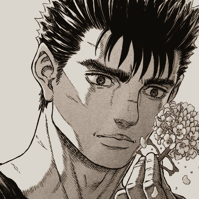
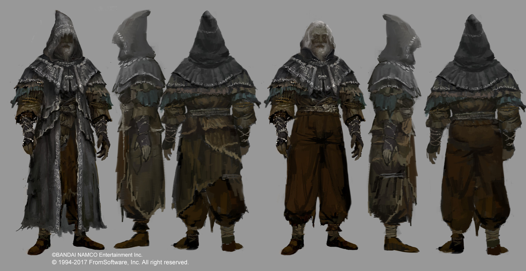
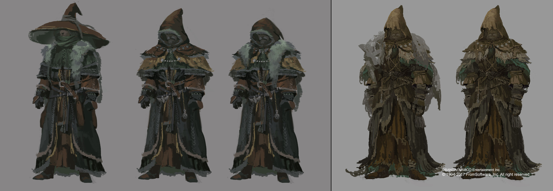
 I sought to create an understated and not very complex pencil and pen drawing. I wanted to obscure the characters face as to not be able to tell any discernible details about them. In terms of inspiration for other artists to draw upon, while less focused on portraiture I admittedly drew stylistic choices from my favorite artist Kentaro Miura. I find his black pen ink illustrations of fantasy settings to be beautiful and I perfect mix of realism and fantasy for a subject matter such as the one I conveyed. Also the conceptual art from FromSoft video games was an inspiration as to the outfit of the character, creating a bit more of a stylistic approach.

Image result for berserk guts

Image result for berserk

Image result for dark souls concept art

Image result for dark souls concept art

Image result for dark souls concept art


Image result for dark souls concept art

sources: 

https://i.pinimg.com/originals/a5/26/c3/a526c396085ef328e3c0182e2272539b.jpg

https://i.ytimg.com/vi/unnN5X_KbBw/maxresdefault.jpg

https://i.pinimg.com/originals/07/aa/9e/07aa9ec2bfb6935304b51d73030684a3.jpg

Alter Ego Project

For this project, I had an extremely hard time coming up with an idea of what would truly represent me. On the assignment sheet, one of the prompts listed was, "Are you a different person in different situations/settings?" This really stuck out to me. I realized that the best representation of my "alter ego" would be to portray what I feel in my mind, versus what I actually present to those around me. I often think about the facade that I put on in group settings, but I know when I am at home I act and think very differently. I have always been the type of person who refuses to let others see my true emotions and struggles, and I tend to put a "plastered" smile on my face when I am in public despite what I am truly feeling inside. When researching different artists that incorporated this type of deeper meaning in their work, I was really attracted to both Frida Kahlo and Francesca Woodman. I have always been fascinated by Frida Kahlo's work, but it wasn't until this project that I made a connection between her pieces and my intentions for my alter ego. In Kahlo's work, she often portrays herself in many different ways. She was severely injured during her life, and used this in her artwork to show her inner self versus her outer self. This is exactly what I wanted to do for my project, as well. When looking at Woodman's work, she shows different internal struggles through different media, which I found to be extremely interesting. When going back to my own project, I realized that I would have to be somewhat vulnerable in front of my classmates, which is something I am still not entirely comfortable with. Despite my hesitations, I decided to proceed with my original idea for the project. All my life, I have struggled with severe anxiety and depression. I have been medicated for this for many years, and often make jokes about being on medication as a way of coping with my condition. I never really let people know the true limitations these conditions have placed on my life, one of them being my relationship with food. Eating has always made me extremely uncomfortable and food has never been a "friend" of mine. I have always used art as a type of therapeutic tool for me and I wanted to finally show my inner struggles in my project, rather than masking them behind a facade. I used acrylic paint on canvas to convey this. For the background, I liquified several cool, subtle colors using a matte medium and added them in layers into a single cup. I then poured the cup over the canvas in order to create a "marble-like" pattern. This represents the constant motion of my thoughts and the mild color scheme represents my shyness. I then painted a gray, emaciated body on top of this. This represents my anxiety, depression, and hatred of the way I view food. I painted the entire body gray because I feel that this color represents my struggles, and is a nice contrast to the background that is filled with different shades of blue. I am still not 100% confident knowing that I will have to present this project in front of the class, but I am willing to take the risk. I really enjoyed this project, despite how incredibly difficult it was for me.


Sunday, April 7, 2019

Alter Ego Project


Blog Post 4/7/19

For this project, I really struggled with coming up with a way to execute my ideas for my alter ego onto paper. I started with just a self-portrait, but I was having a hard time coming up with ideas for what to include on the paper. I decided early on that I thought watercolor might be a nice way to so the fluidity of my life to this point. I choose then to use watercolor pencils as a way to keep some control over the use of color throughout the page. For the background of the piece, I took some inspiration from different watercolor artists whose work I have come across in the past. I looked at work by the artist Beverly Brown who specializes in watercolor paintings. I really liked how many of her landscape paintings had a translucent almost barely there feeling about them that I wanted to try to mimic in my own piece. I choose to do a landscape for the background because I wanted to add into the piece a little bit of where I am from. Being from the Pacific North West the landscaping is very different from Southern California. I felt it was important to include a bit of my history in where I grew up in a piece about an alter ego because growing up where I did has shaped me as a person and I felt like it was important, especially in a self-portrait to include a piece of that. Something I have always been interested in in my work is the use of outlines, specifically within the context of layering. In the past, I have used watercolor and black ink to outline a portrait or the watercolor itself to give it an enhanced feeling and some added dimension. I choose to outline my self-portrait using black yarn and glue to symbolize what my hands are doing in the piece which is holding a string puppet. The puppet itself is not visible in the painting because I am meant to be the puppet, this could be interpreted as me standing underneath the piece having the string from my self-portrait’s hands reaching down coming in contact with me, almost as if I myself also become a part of the piece. The string that is used in the piece is a representation of the puppet from which it holds. For the outlining, I took inspiration from the work of Allison Kunath who specializes in blind contour drawings. She uses a pen to blindly draw portraits of people using a contour technique. I really like the look of these types of drawings and thought that something similar might be fitting of my piece which is supposed to represent me. The piece in its entirety is meant to represent me having influence from my original home attempting to have control over me now. My alter ego is the part of me that still belongs there but can’t be while the me now struggles to break free of her grasp (hence the string).


Images imported from https://fineartamerica.com/profiles/beverly-brown.html


Alter Ego Project

Sammy Keane
“Lexapro”


For this project, I chose to write about my personal process with starting the anxiety medication Lexapro.
As I was thinking about the different ways to demonstrate my alter ego, I came to realize my feelings and
actions towards this medication. I am in the beginning stages of taking these meds so I chose to write down
my emotions towards them for the past three days. “Lexapro” is created on a 24x36 sheet of pale yellow
Canson paper created with pen and charcoal. My decision to make the words rather scattered was to mimic
how my scattered brain when I am on the medication. The words are not only written in a dispersed way but
the sentences themselves are mixed up throughout the piece. This was a way for me to continue to hide
behind this side of me while only showing bits and pieces of what I am going through. In addition to that,
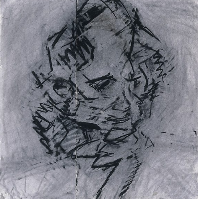
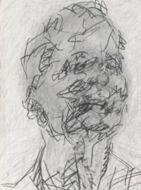
I chose to draw a self-portrait in a rather abstract and rough style to show me looking almost crazy or lost.
The self-portrait is from my hips up and is drawn to depict a combination of myself and a deranged person.

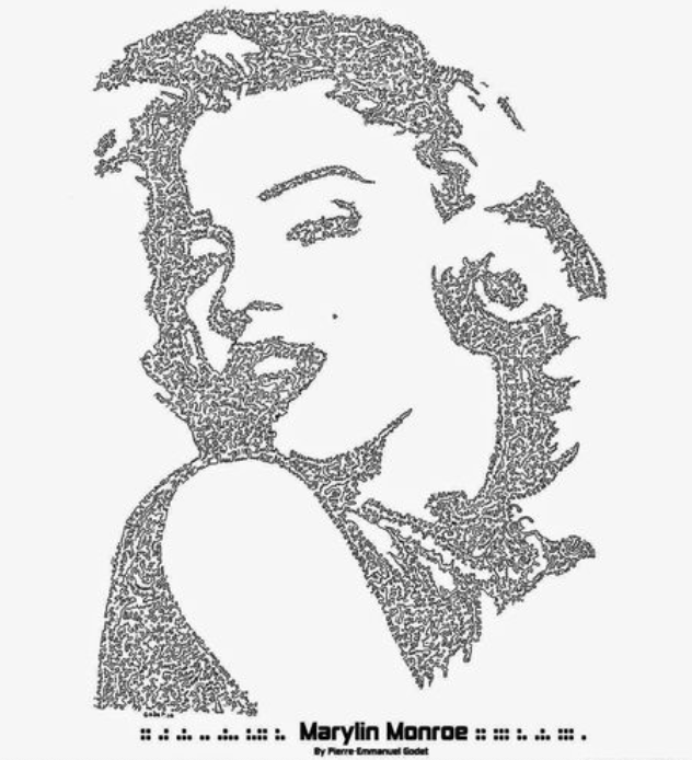
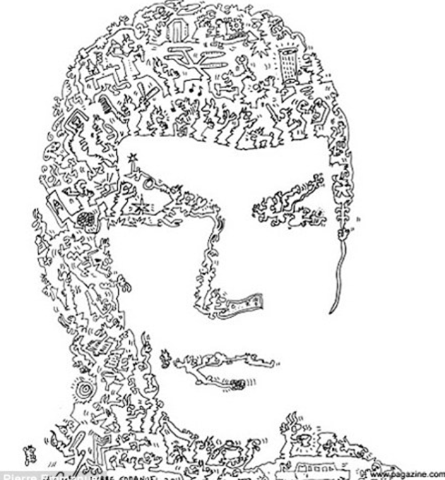
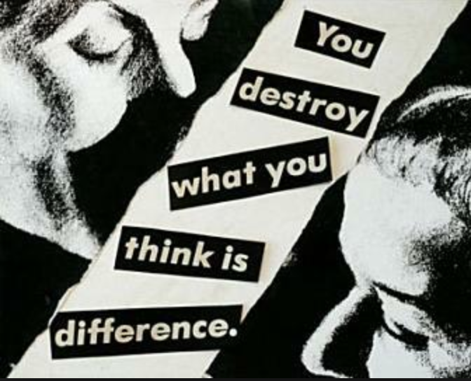
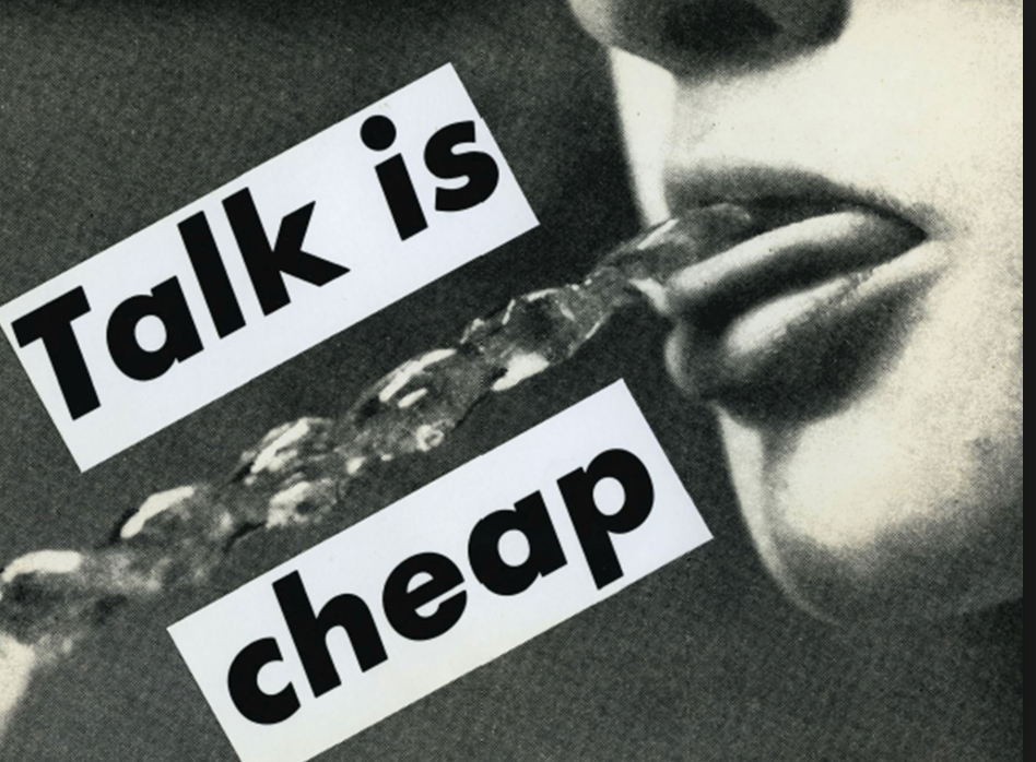
When I was writing out the words I was looking at works from artists such as Barabra Kruger, Jenny
Holzer, and Pierre Emmanuel Godet. I was noticing the ways these famous artists successfully incorporated
texts into their works without it being distracting or too kitschy and instead was meaningful. Specifically,
I was looking at Pierre Godet’s text work and single line work. I was interested in the way his single line
works were different yet exciting.  


Prior to drawing the self-portrait aspect of this piece I was looking at charcoal drawings done by
Frank Auerbach. I am very interested in the way he depicts his portraits in an emotional, active, and
intriguing way. I wanted to create my self-portrait in this moving and gestural way. Tate.org mentions that
Auerbach does not visualize a picture before it begins. This is something that I have been working
towards in my own creative process.


Sources of influence:


Monday, April 1, 2019

Collage Blog Post

 The process of creating collage is incredibly organic and unique. Personally, when I create collage it is very fast, random, and created at the moment. I like the neurotic nature of taking razor blades and slicing into magazines to carve out that one flower from that one perfume ad from 2011 that I really like to then end up not even using it, rather using a conglomerate of text for a meaning I had yet to distinguish. While researching other artists who utilize collage, I found that I really respected and loved some of the complexities in this relatively simple gesture. First and foremost was Ben Lewis Giles, who's understanding and utilization of repetition and attention to detail was captivating. Every single cutout was deliberate and intentional, and the Jarrolds series really captivated that. The whole page was full, not a corner was exposed. It was overwhelming and loud, and it really resonated with me. Another artist that I found while trying to pull inspiration was Nydia Hartono. In contrast to Giles, Hartono's works feel more like a collage than a mural. It is intimate, rough around the edges. There are bright colors, definite cutouts, and though the viewer isn't inundated with information it is still a gripping work. They are all well composed and hold enough information to grasp the viewers' attention and draw them into the piece. I wanted to translate that into my pieces, since the style of my "collage"-ing tends to be more "in-the-moment" or off the cuff than deliberate like Giles. Hartono's style really spoke with me and resonated, utilizing beautiful photography with some pop references or wild pattern. Similarly to Hartono, Jessie Craig's style of collage was very simplistic. She used a lot of repeated images or references, concrete color schemes, yet was as deliberate as Giles in her precise cutouts. In collage, I prefer precise concise cuts. though my work style is haphazard, to say the least, I tend to prefer work that is a little more clean cut or neurotic. I love slaving over a page cutting out tiny flowers, thin lines, cutting out faces of models to leave the image hollow. That is my personal style of collage, so I love looking at work that is different. Craig uses images in a way that creates a vibrant aesthetic, something that you imagine when looking at Brandy Mellvile's Instagram feed of VSCO filters and flowers. Craig also cuts images and reconfigures them to make a new image, which is a concept that is fascinating to me. Its parody and appropriation with an artistic twist- I like that a lot. Unlike Hartono, Craig's works don't outright look like a collage. Some of them do, some of them look surreal and natural. Almost like a scrapbook that was a little too well done. Overall, collage is a unique and immediate form of self-expression that can be done in a variety of ways. Whether one decides to fill up a whole page with cacophonous information or utilize a few repeated images to portray a message is up to the user, and the immediate gratification of a completed work is equally as satisfying.

ARTWORKS


WEBSITES I GOT THE IMAGES FROM:
Ben Lewis Giles: https://benlewisgiles.format.com/6085373-2019#28
Nydia Hartono: https://www.nydia-hartono.com/mood-magazine#4
Jessie Craig: https://jessiecraig.format.com/collage#2

Wednesday, March 13, 2019

For this assignment I mainly drew from the work of Liz Peniazava for inspiration. Like we talked about in class Liz uses images of women from old playboy and pinup magazines and creates new context by contrasting their sexuality with bright femininity (such as flowers). She also defaces most of the women which makes their sexuality anonymous and seemingly uniform. Her use of bright colors and flowers exaggerates the eroticism of these women but also makes them inviting and pleasing to look at although some of them are somewhat crude.      


I was especially interested in her idea of covering the face and mimicked that idea in my own pieces. The idea of female beauty and femininity is constantly being advertised and projected to the world. Young girls often compare themselves to these images of what a female is supposed to look like and how she should behave. Although many people look at models bodies and strive to achieve that same thin and long shape I think there is something intriguing about the face and the idea of the perfect or the more desirable face. When the face is taken away what really are we? The face is the most defining feature of a person, it is how we navigate our world. In fact, our brains are hardwired to recognize faces even in inanimate objects. So when the face is removed we become unrecognizable and seemingly just like everyone else. This also means that we would not be able to navigate a world without faces and thus be lost all together. In comparison what about the act of putting on faces that don’t belong to us? For example, the act of putting on make-up or putting on a happy face when inside you are crying. I played with this idea by putting faces on top of other faces and also by detaching faces from their original source to reveal something underneath.      


http://www.lizpeniazeva.com/2018/2/25/welcome-home
http://www.curvemag.com/Culture/Cut-It-Out-Feminist-Collage-Artist-Liz-Peniazeva-Is-Reimagining-Queer-Contact-Relations-1901/