Wednesday, March 13, 2019

Collage Blog Post


Ali Sykes
ART 318-Advanced Drawing
Collage Blog Post

            This project was quite a bit intimidating to me at first, being someone with very little experience interacting with collage and even less creating collage pieces. Upon beginning my research for potential contemporary collage inspirations, I was initially drawn to GL Woods’ work, specifically the piece “Super/Model,” and Joe Moorman’s work, specifically the piece “Pink Champagne." I liked how both pieces were completely covered with material, value and images; I felt like there was always something new to look at and the pieces both felt very complete because they were in a sense “full.” In GL Woods’ “Super/Model,” I liked the idea of having a collaged background behind the aspects of the piece that are the main focus. In Joe Moorman’s “Pink Champagne,” I liked how the repeated use of related images, in this case pink things, created unity in the piece.
            Then I came across Rocio Montoya’s and Raphael Vincenzi’s work. Both of these artists did not completely fill their pieces with collaged media like GL Woods and Joe Moorman, however, their pieces still felt very complete and balanced. Seeing their work showed me that not all collage pieces have to be completely “full” in order to be successful. Both artists construct their collages so that each piece is interacting with each other in a sense, which created unity through shape. Seeing Rocio Montoya’s work gave me my initial idea for my collage series of hands, because in the majority of Montoya’s collage work, hands are present. I have always had a fascination with hands and their elegance and expression, so I thought this would make a good starting point for my series. I further developed the statement I wanted to convey with hands in my work when I came across Raphael Vincenzi’s work, specifically his piece “Gala,” which depicts a seductive woman with her hand placed on her shoulder. I began thinking about why I thought hands were so elegant, and made a connection between women’s hands and the media, specifically fashion magazines that I and so many other girls grew up reading and internalizing information from.
As I began researching the portrayed of women in the media, and came across Jennifer Siebel Newsom’s documentary “Miss Representation,” which premiered at the Sundance Film Festival in 2011, which discusses the issues with the portrayal of women in the media and the negative effects it has on women, both young girls and grown adults. I also came across The Atlantic article “Women’s Magazines Objectify Women Just as Much as Men’s Magazine’s Do,” which, as stated in the article’s title, discussed how women are portrayed in the same sexual, seductive, and flawless way in both male-targeted and female-target magazines. As I began flipping through those same magazines that I once idolized as a young girl, like TeenVogue, Elle and Glamour, I saw this overwhelming reoccurring theme of woman in seductive poses, and each pose further accentuated by the placement of the woman’s hand, whether it be tucked into her shirt, in these elegant and unnatural positions, or positioned on her inner thigh. If so much sexuality can be conveyed just from a hand of a woman in a magazine, the body that hand is connected to is bound to leave an even stronger impact on the viewer.
              When creating my series, I drew from all aspects of my research and incorporated things I found successful in other pieces into my own pieces. Some of my pieces are completely full of material and value, which some are not as full. Some aspects of my pieces interact with each other more than others. For the backgrounds in a few of my pieces, I chose to collage images of traditional, feminine looking fabrics and patterns in order to convey a strong sense of femininity and also to highlight the archaic and traditional views of womanhood. Overall, I think when my pieces are viewed together, they are stronger in conveying my intended meaning because they all use different methods to do so.


Images


"Super/Model” by Wolfeyes (GL Woods)
Via One Art space


"Pink Champagne” by Joe Moorman
Via Revision Fine Art


By Rocio Montoya

Via Rocio Montoya Website


By Rocio Montoya
Via Rocio Montoya Website


“Gala” by Raphael Vicenzi
Via Colagene Creative Clinic


Sources/Influences

“Miss Representation” 2011 documentary by Jennifer Siebel Newsom

The Atlantic article “Women’s Magazines Objectify Women Just as Much as Men’s Magazine’s Do”

Collage Project "Sparkly Faces"

Sammy Keane
“Sparkly Faces”


“Sparkly Faces” is a four-part series that depicts continuous-line drawings of faces made of glitter.
These glitter drawings are created on top of an abstract, cubist, and collaged handmade background.
The backgrounds themselves are made up found pieces and patterns from artists in several series of “Art Forum’s”.
In no specific order, the artists included in creating the backgrounds are Carol Brown Goldberg, Galerie Thaddaeus Ropac,
Sue Williams, Keith Haring, Keltie Ferris, Favid Allan Peters, Howard Hodgkin, Li Songsong, Greene Naftali,
Mel Bochner, Paul McCarthy, and Louise Bourgeois. These backgrounds were combined simply in a stylistic
manner where I cut out square-like or rectangular shapes to try to compile an interesting, engaging, and active setting for
the face to be on without it being too distracting. Lastly, while compiling the “Art Forum” cutouts, I tried to keep a consecutive
style or color scheme to make it flow nicely. I chose to create faces on top of these backgrounds because I wanted to depict what
maybe my face would look like if I were looking at these colorful backgrounds. The faces are very abstract and in some cases hard
to even depict as a face, but that was my overall goal. For this series, I was not only inspired by the artists listed
above but when I was creating the face I was looking to artists such as Allison Kunath and Picasso. I have
always enjoyed Picasso’s cubist and abstract depiction of faces. I tried to convey this same loose technique with
the contour and continuous techniques of Allison Kunath. Below are pictures that inspired me by Picasso and Kunath.


In addition to Picasso and Kunath, when laying out the background and trying to integrate glitter in a successful way, I was looking to the Mickalene Thomas's work. Thomas is amazing at coming up with beautiful color schemes and consecutive patterns to compile an active collage piece. She also is very successful in incorporating glitter on her works in a subtle and nice way. I have used glitter in some of my artworks in the past and I love the way it adds not the only dimension to a work but also adds a very inviting and moving aspect. Below are some pictures of Thomas's work that inspired me to use glitter but also helped me with laying out the backgrounds.


References and links used for more inspiration. 


Collage Post


Collage Project Post:

For this project, I decided to take a lot of individual images that inspired me in their own ways and see what kinds of pieces I could imagine with all of the small parts I gathered. What I knew when I started is that I wanted to combine floral elements with gathered body parts/ facial features. I've seen a lot of different artists do similar things but with these pieces, I wanted to use the body pieces to accent the shapes of the flowers. I think floral designs add a really eye-catching layer to the overall pieces. So in each piece of the series, I had each piece incorporate different parts of the body that media/ magazines tend to focus on. One piece represents eyes, one is lips, one is hair, and the last one is the body. What I decided to do in the body one was making a bit of a play on The Birth of Venus painting by Botticelli, which is a piece that has influenced a lot of my work throughout my life. Renaissance art is one of my favorite artistic periods which comes through in quite a few of my pieces, but in this one piece, I tried to show depictions of the female body throughout art history while also having the focal point on a modern woman. Through a lot of my research, I tended to find collage pieces that have one main figure/ person in the piece, one example of this is the series "Happy People" by the artist, Kerstin Stephan. This series focuses on individual portraits of people that have been manipulated with collage to create a new image.  I really liked this idea of having one central figure with the rest on the piece stemming from the individual. Each of the pieces in my series has this theme to it while also keeping with my floral body part idea. In these images, I almost wanted to create a bouquet of eyes and a bouquet of lips, kind of playing off of the floral theme that I have kept present throughout.


https://www.arc-sf.com/collage-a-rama-in-san-diego.html


https://www.saatchiart.com/art/Collage-Floral-Mind-11-SOLD/69802/3029025/view


https://www.arc-sf.com/collage-a-rama-in-san-diego.html


http://www.ryeartgallery.co.uk/gallery-artists/1093/2558/sally-anne-fitter/still-life-collage?r=gallery-artists/1093/c/662/sally-anne-fitter/paintings-drawings


https://www.arc-sf.com/collage-a-rama-in-san-diego.html


http://kerstinstephan.com/home/2014a.html
https://www.youtube.com/watch?v=wdCbyhgE0_E

Tuesday, March 12, 2019

Collage Blogpost

For each of my four collages, I chose to implement them with as little elements as possible. All four consisted of three different cutouts from various magazines and books, particularly from ones that focused upon fine and contemporary art. I sought to implement both geometrical and more obtuse forms together, to create a sense of conflict from the two different styles.
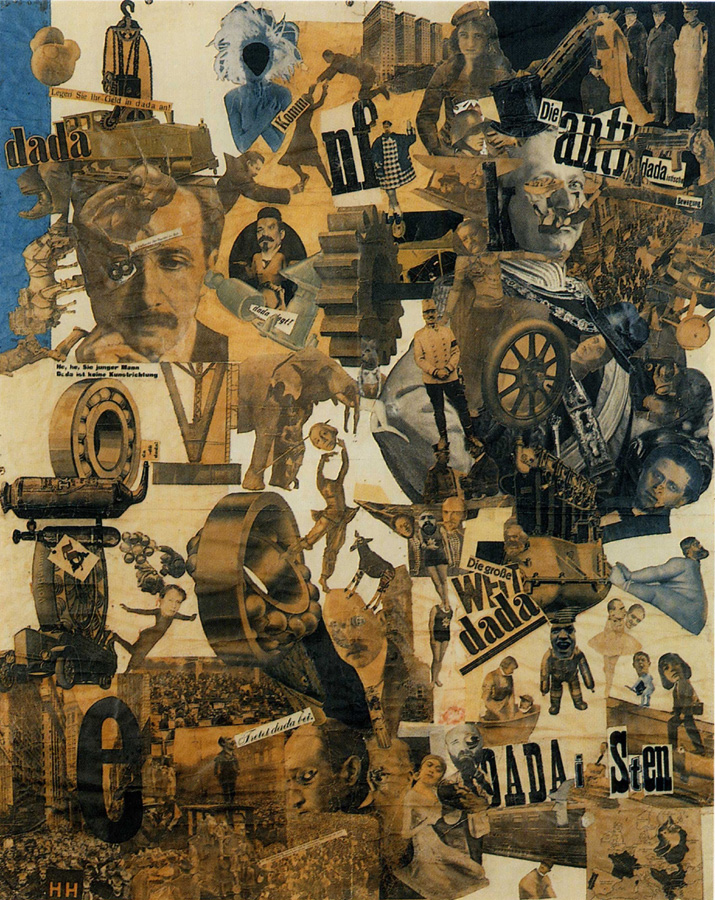
I drew a great deal of inspiration from Dada artists, in particular that of Hannah Hoch. Her work within the Dada movement of the early 19th century was paramount in terms of how I went about constructing the four pieces. Within much of her work, she used minimal elements taken from a whole array of sources, creating often absurd yet readable compositions. I sought to follow in suite, incorporating as few components as possible yet muddying the compositions further. While there are pieces of hers such as, Cut with the kitchen knife Dad through the beer-belly of the Weimar Republic, 1919, that had an almost cacophonous tone due to the pure chaos embodied, this intensity is often scaled back in her more minimalist work. On one hand, I truly enjoy the intentional choice of less elements such as within her piece, German Girl, 1930, yet there often feels to be a great deal of unused space and a hard edged border. While on the other hand, in the aforementioned piece Cut with the Kitchen Knife, while there is a sense of chaos it at times feels disjointed and less interwoven such as components within German Girl.
I sought to draw inspiration from this dichotomy by taking a more stripped back approach yet through the use of samples from sources that are texturally rich and diverse, to create a sense of submersion for the viewer. In addition, through diving deeper into her overall body of work, her use of negative space in many of her portraiture pieces was often large and noticeable. This in turn often left the subject centered within the composition, with a great deal of the page the cutouts were glued upon still visible by the viewer. In turn, I thought it would be amusing to create a greater sense of claustrophobia by rejecting any use of the paper, as it would separate the elements. In turn, this had the effect of all of the cutouts overlapping upon one another. By cutting the rest of the paper away this led to the overall shape being abnormal which in turn did not align to Hoch’s rectangular frame that she often implemented.
A particular difficulty that I found within constructing these pieces was deciding upon which cutouts to choose from and to implement within the different compositions. Being that there was only three elements within each, this lead to a greater deal deliberating and deciding upon which would fit best. With restrictions gave a greater sense of thought and contemplation.


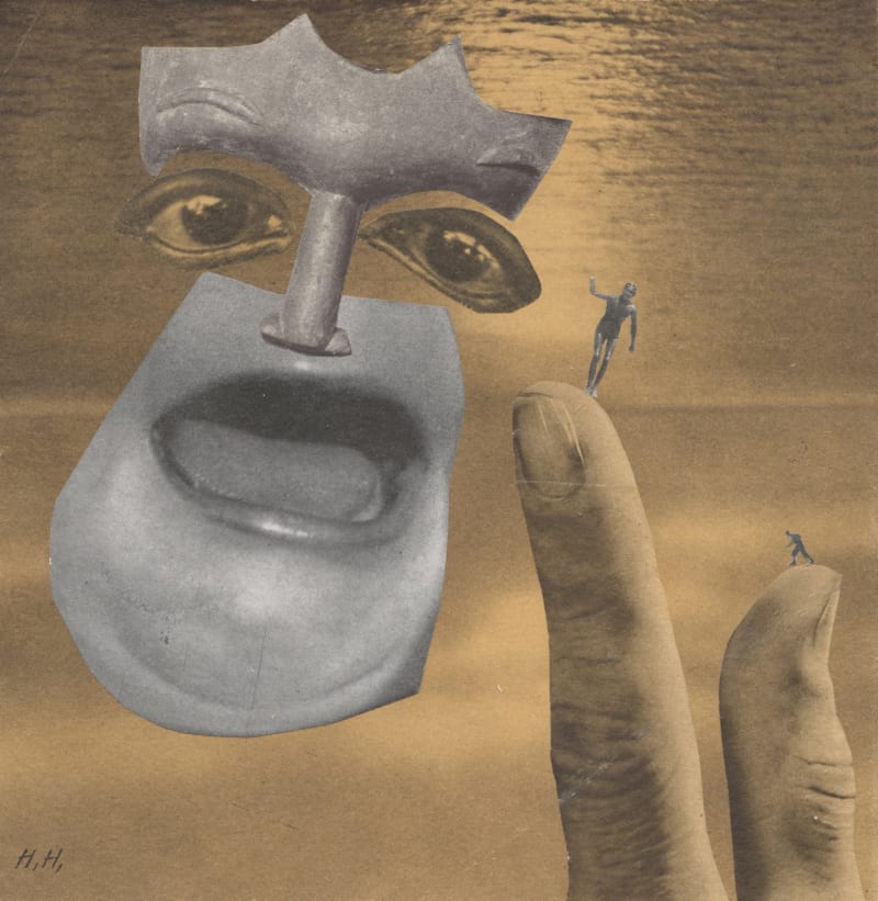
Over the Water, 1943 - 1946 by Hannah Höch
https://www.artbasel.com/catalog/artwork/71260/Hannah-H%C3%B6ch-Over-the-Water


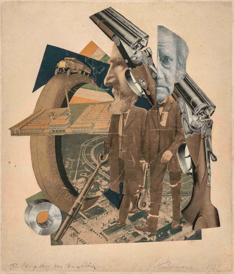
Hochfinanz, 1923 by Hannah Höch
https://www.artbasel.com/catalog/artwork/67415/Hannah-H%C3%B6ch-Hochfinanz

Image result for mischling hannah hoch
http://www.rachelwithers.com/hannah-hoch/

https://en.wikipedia.org/wiki/Hannah_H%C3%B6ch#/media/File:Hoch-Cut_With_the_Kitchen_Knife.jpg

Image result for hannah hoch german girl
https://arthistoryproject.com/artists/hannah-hoch/german-girl/


sources:
Withers, Rachel. “Hannah Höch.” Rachel Withers, ArtForum, 2014, www.rachelwithers.com/hannah-hoch/.

Hudson, Mark. “Hannah Hoch: The Woman That Art History Forgot.” The Telegraph, Telegraph Media Group, 14 Jan. 2014, www.telegraph.co.uk/culture/art/10545071/Hannah-Hoch-The-woman-that-art-history-forgot.html.

Collage Project

Initially when told about the collage project, I immediately thought of Barbara Kruger. I first saw her work in high school and was immediately captivated by her collages. Kruger uses a mixture of red/white text over black and white images to portray feminist stereotypes/culture. Finally, when the opportunity presented itself, I got to see a couple of Barbara Kruger's pieces in person at the Broad Museum in Los Angeles. This was the first instant where I thought of collage as a real art form. Before seeing her works, I viewed collage as an elementary school project that every child gets to experience at some point in their lives. When I was younger, I would collage pictures of my favorite celebrities using cutouts from TigerBeat Magazine and hang them all over my room. Never did I think that someone could be considered a "collage artist." After discovering this, I began to research more collage artists. Among my research, I came across an artist named Jessie Craig. She is a London-based photographer who has shot with some very elite clients, such as Topshop and Burberry. Born in Canada, Craig began exploring photography as a teenager. Eventually, her work has evolved, thus leading her to create collage pieces using photographs. I absolutely love her work because it combines fashion photography with the "cut and paste" style of collage in order to create really interesting pieces. Finally, the other artist I came across who truly inspired me was Nydia Hartono. She is based in both Singapore and Boston, and is around the same age as myself. Her being so young makes her works relatable and captivating. She uses mixed media including photographs, paint, etc. in order to create pieces that are unique and vibrant. For my own project, I decided to stick with the same concept of black and white photographs, mixed with slight color accents. I am very interested in the fashion industry, so I chose to cut out black and white photographs from fashion magazines, but hide the identities of the models by placing two-toned, gold accents over their eyes. I also included black and white patterns overlaying these images in order to incorporate the "fashion" element in yet another way. Textiles and patterns are so important in design, and I think a solid basis in this is essential in a successful piece. I took inspiration from these artists and now see collage with a new perspective and new found respect.

Links:
http://www.artnet.com/artists/barbara-kruger/

https://jessiecraig.format.com/collage

https://www.nydia-hartono.com/mood-magazine#0


Jackson Collage Post

After being assigned this project, I was a little lost on where to start. While I have created collages before, they were for fun and not part of a project, nor did they have to respond to any other artists work. My work with college in the past was purely a creative outlet. My initial idea was to create a work in a completely different style that I have done in the past. However, after completing a few test collages, I realized that this mentality was not going to work. It stifled my creativity and ultimately made my collages far less interesting. For my final works, I tried to create a happy medium between influence from other collage style and my own creativity.

The two artists that I researched and work I was drawn to were Hannah Hoch and Varvara Stepanova. Both artists worked in the 1920s, but both had a very different style and visual aesthetic.

Hannah Hoch is a Dada artist who is best known for her work as a Photomontage artists as she was one of the pioneers of the technique. Photomontage as defined by Artsy, is “A technique best known for its close ties to Dada, photomontage is a type of collage in which photographs (either taken by the artist or sourced from mass media) are assembled into a single composition.” She was fairly well recognized for her contributions to this art form as well as the dada movement.

In addition to Hannah Hoch, I did research on Varvara Stepanova. While producing work at the same time as Hoch, the two have very different artistic styles. Stepanova was not known as a photomontage artist and is most recognized for her work in other disciplines. Despite this, here collages are very successful and an interesting source of inspiration in my own work.

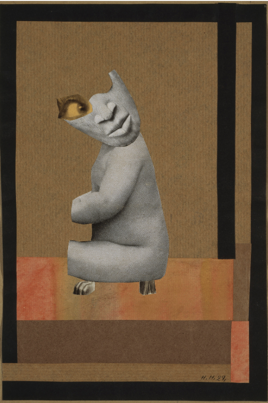
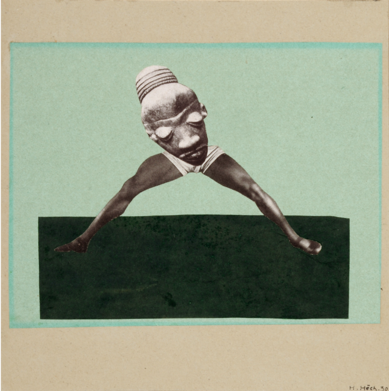
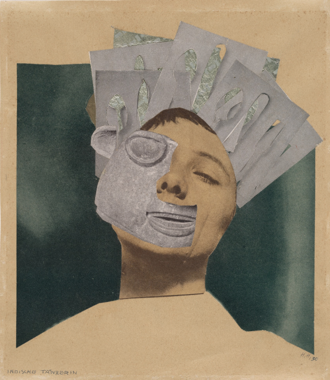
The parts of my work where I used Hannah Hoch as inspiration can be seen in the black and white found fashion imagery and how it is arranged. She not only used a lot of black and white photography but also arranged them in such ways where bodies were matched with different heads and alternate perspectives were created. I tried to emulate this style in three places within my collages; the eye that utilized a cutout and other imagery to recreate its brow, the fence with the feet recreating foliage, and the sardine can with body parts coming out.

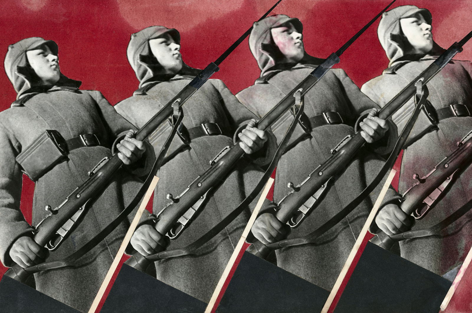
As far as my inspiration from Varvara Stepanova goes, I used her use of repetition and strong contrasting imagery within my collage. This can be seen in the three pairs of legs with the reattached heads. It can also be seen in my use of backgrounds and using a pattern in multiple different places.

Ultimately I think my college was successful in its use of inspiration from other artists while still incorporating some of my own personal style and aesthetics. It is a fine line between references and plagiarism, if done correctly it can amplify a message and add to an already existing conversation.


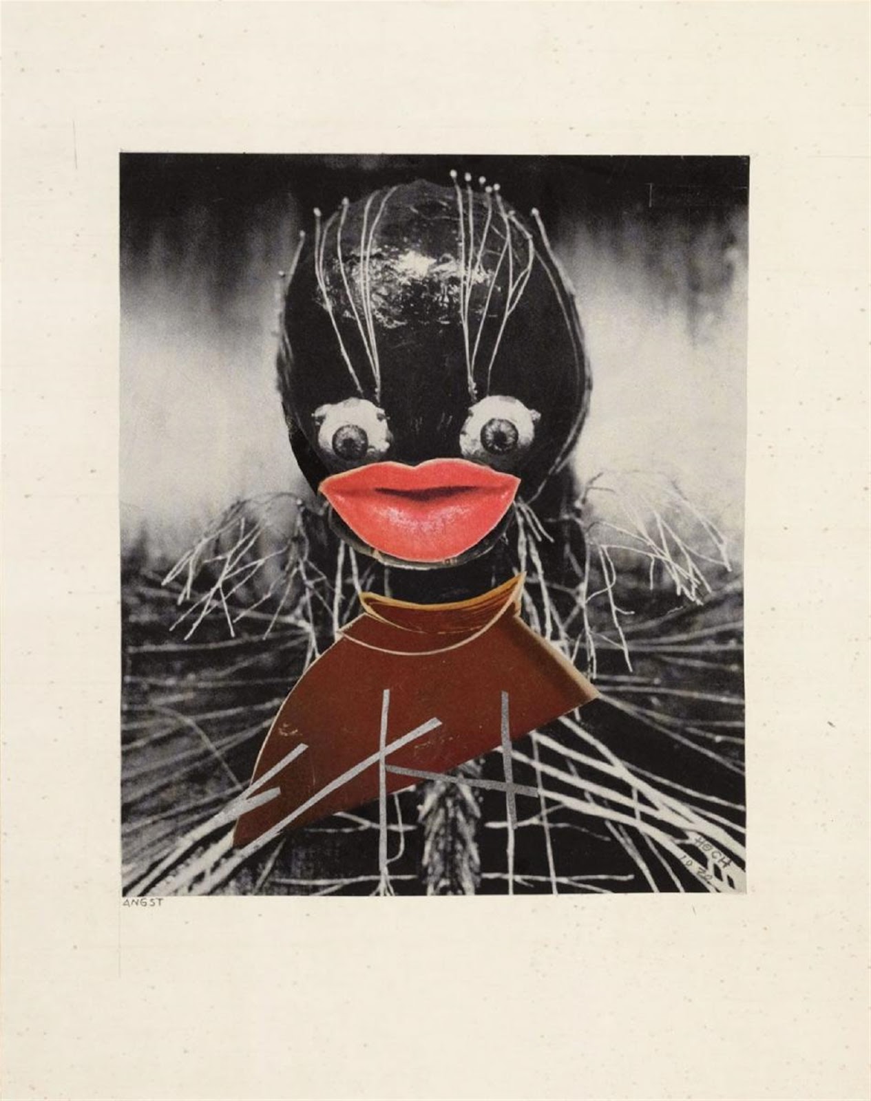
Hannah Hoch, Angst

Hannah Hoch, Untitled
 

Hannah Hoch, Untitled

Hannah Hoch, Indian Dancer

Varvara Stepanova, Red Army Man


Research:
Höch Hannah. The Photomontages of Hannah Höch: February 27 through May 20, 1997, the Museum of Modern Art, New York. Walker Art Center, 1997.

Melanie. “Badass Lady Creatives [in History]: Varvara Stepanova.” Design Work Life, 25 Dec. 2013, www.designworklife.com/2013/12/25/ladies-in-history-varvara-stepanova/.


Monday, March 11, 2019


For the collage collection, I researched different artists specializing in collage work and came across one in particular whose work I really resonated with. I really appreciated the work of Bri Lamkin whose works are expressions of different topics including feminism and mental health as well as Earth conservation (https://brilamkin.format.com/about-me). She creates these collages by combining landscapes and prints with vintage photography specifically from the nineteen fifties and sixties, in order to create a light-hearted approach to these topics. I really enjoyed her minimalistic approach to collage and tried to mimic that aesthetic in my own pieces. I really love how she uses a combination of black and white and colored photographs and plays around with the depth of the collage as a whole. I think that this technique works well with the concepts she is trying to portray in her art. In class, we discussed some of Martha Rosler’s work with collage and I really felt that the message she was portraying was strong and I wanted to try to create pieces that carried a powerful message about the society that we live in. Many of her creations revolve around the narcissistic tendencies of today’s youth in relation to real-world problems such as poverty, hunger, and war. I think that her combination of elements in her pieces really shows the ugly side of the world but in a beautiful and thoughtful way as if not to criticize but to point out humanity’s negative characteristics. With my collage pieces, I wanted to take inspiration from these two artists and create pieces that utilized black and white as well as colored fashion photography and landscapes to illustrate the oppression of women specifically of women’s bodies in the advertising industry and within social media. I wanted to showcase the way that women presently and, in the past, have been treated as objects in order to sell products or just for entertainment purposes. For the execution of my collage pieces, I started by looking at different fashion and art magazines for black and white photographs of women looking at both vintage and contemporary photographs. Then I started looking for different colored landscapes and interesting prints of or related to water and/or the movement of water. I also wanted to include gold foil to help extenuate the parts of the body that I was cutting away. On some of the pieces, I cut away the women’s faces and replaced it with the gold foil in order to stress the individuality that is taken away when women are objectified in the media. I also wanted to use the prints that I found to replace other parts of the body or clothing to add some depth to the collage. Another aspect that I wanted to convey was the idea of serenity to combat the issues such as the ones that were discussed by mixing landscapes and adding photos to it. I added it as a way to portray a sort of hope and also to sort of combine the new and the old and show their pros and cons.

Retrieved from https://brilamkin.format.com/collage


Retrieved from https://www.artsy.net/article/artsy-editorial-martha-roslers-powerful-collages-wake-up-call-america