Tuesday, April 18, 2017

Self Generated Project

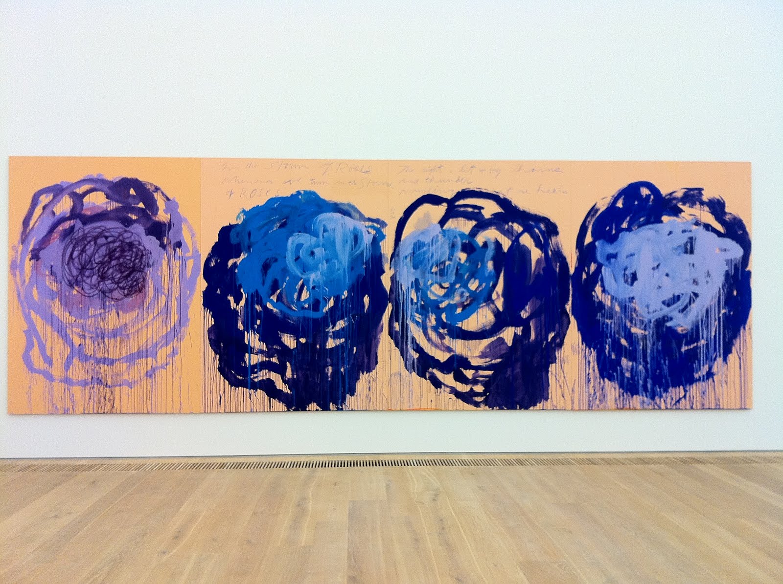
This self generated drawing project was interesting because I have never created something and then drawn it, usually the other way around- drawing something and then creating it. At first, I had a difficult time trying to think of what to form from the paper clay. The clay was drying quickly, making it hard to knead. When doodling, I always seem to draw flowers and that's what I started to make. I made a rose, and found some dried leaves and twigs around where I was sitting. I stuck them into the flower to add a second element. This created an almost prickly, dangerous appearance to my rose. This made me think about the duality of the delicate, tenderness of rose petals with the sharp, threatening points of thorns on rose stems. Nature is a large part of my inspiration in my art work. I love to be surrounded by nature, as it's rejuvenating and full of beauty. For my project, I considered texture and use of materials to be important factors. I also like to reuse material that would normally get thrown away or is "scrap". Looking through my stuff, I found sandpaper, sheets of paper between duralar, and newsprint that would be effective for my project. I cut out petals from the thin sheets of white paper that was separating the duralar, and arranged them into a flat rose on the newsprint. I shaded them individually with graphite pencils and then used black ink on top for stronger lines. The outer edges of the paper petals curled up to create a 3D look. I cut out twig-like forms from the sandpaper and glued them coming out from the rose. Around the rose, I put dots of ink, as if the pollen was dispersed into the air. I decided to keep the theme simple and practically colorless, which is out of the ordinary for me. This piece is minimalist, without narrative. I actually really liked the end appearance and am willing to create more pieces like it. Cy Twombly has related works, especially his work "Untitled (Roses)". He experiments with a simplified form of abstraction. His work is very gestural, and I like his use of minimal color.
Image result for cy twombly the rose
https://dayoftheartist.files.wordpress.com/2014/02/untitled_secsplsh.jpg

Self-Generated Subject

The self-generated subject project reversed the usual approach to drawing because it involved the application of our imagination to a greater extent right off the bat. Instead of simply drawing what we see, we took a step back and created and made our subject, thus rendering a work that is uniquely personal.

When molding my creature, I had originally wanted it to look like a fox. I drew inspiration from my dog, whom my sister and I often say looks like a mix between a fox and a weasel. Of this initial concept, only one thing made it through the trial and error phase of molding: the ears. The creature’s ears are about the size of its head, a trait it shares with my dog. When trying to make the body, I was applying my high school Ceramics I knowledge. I used a cognac cup as a mold in order to get the rounded shape and I liked how the bottom of the creature seemed to flow off like cloth, so I decided to make it a ghost. . I knew I wanted something to ooze out of the ghost’s eyes, and in the end I decided to make flowers grow out of the holes and out from under it. The concept behind this decision was the resilience of nature in that it ultimately defeats the test of times and is able to grow, adapting to its surroundings along the way, in this case, growing around and finding a way out. In a sense, I see my ghost as a defender of nature.      
 
One of the artists whose work I looked at closely for this project was Allison Schulnik. After having seen her videos in class, I was moved by her claymations because the creatures she makes are not particularly “cute” or “pretty”, but they have a strong presence to the point that the viewer can sympathize as they melt into nothing. I was mostly inspired by her ability to give each creature a personality despite the simplicity of its form. I have attached a link to one of her videos. The creature in the picture is one of her creations. As you can see, it looks like it’s up to something, almost mischievous, and yet it looks like it is surprised to be seen.


For the drawing, I decided to work with soft pastels because they would allow me to get the range of value and color that I wanted. I typically work very rigidly with pastels, blending to the point of no return, that is, muddiness. However, recently I have had this new found appreciation and fascination for chaos and messiness (I have my room to prove it). So, I used a combination of blending and overlapping of color. A closer look at the drawing will show that most of the image is made by a blend of different colored scribbles, which give the 2D image a sense of movement. The background was achieved by a more decisive mark making, in which the lines were made with both hands and involved a full body motion to make. It was the most liberating section and the one in which I had less control. The foreground, mainly the table was colored by using the run off, the dust that had collected on the ground below me.


Overall, this project pushed my concept of drawing to a new level where I have to think about the drawing even before I know what my subject will be. It is definitely something that I will continue to explore in the future.  

Self Generated Project!


When I first started the self-generated project, I was as per usual, clueless as to what the content should be. Self generated implied that everything regarding subject and content relied on my own imagination. Furthermore, I was stumped by the paper clay material itself, because it dries and cracks as you use it and doesn’t carry it’s own weight. It would topple over if I formed anything too tall, and many of my trial creations were unsuccessful because of this. But after class one day I was milling around the Old Town Orange neighborhood on a skateboard. This is when I saw a snail shell on the ground of an alleyway, and it’s spiral based form caught my eye as a technique that I could mirror in the paperclay. It was a dull shade of brown, lonely and cracked from sitting in the sun. Inspired by what I had seen, I went home shortly after and began to smooth out slabs of the paper clay so that I could roll them into shells. snail-shell-form-spiral-11879894.jpg
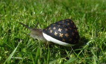
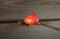
The shape of the shell is interesting because it feels like the spiral could go on forever. When the shell is standing right-side up, it is not really possible to tell where it starts and begins. I like this idea of permanence being juxtaposed with the snail itself, who gets stomped on, run over, ignored, and lives (generally) a short life. There are many artists who address this fate of the crustacean in their art. An artist named Stefan Siverud (http://www.legalassassin.com/?cat=134) uses snails as a way to insert his art into living forms of nature. He takes their natural design, and modifies it to his liking. These are some of his snails:
20_Svartguldkryss_2-211x128.jpg26_McDonalds_1-199x128.jpg

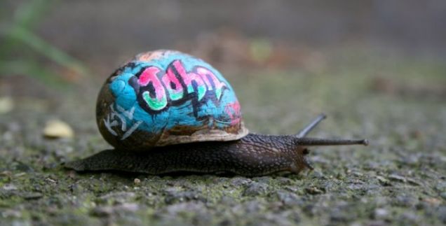
His use of color and symbols that carry contemporary value (aka the golden arches and the Louis Vuitton print) work to humanize the snail, which is so often cast off as ugly and unappealing. I was also inspired by another artist who paints snail shells, named Slinkachu. Their art with snails is made specifically so that the snails will be noticed for their vibrancy and color, and as such will hopefully not get stepped on. I thought it was interesting that they physically attached other objects onto the shell as well, as shown in the photos below. wpid-article-1312294428701-0d4510be00000578-754133_636x323.jpgwpid-article-1312294552732-0d4510ba00000578-726424_466x310.jpg
These artists inspired my use of color in my self-generated project. I was weary at the thought of just making a boring pencil drawing, but these artists motivated me to bring color into the mix and not worry about making things hyperrealistic. For the color in my work, I relied heavily on watercolor pencils. They are easy to blend and control on the pencil work that I had already laid down. From this point moving on, I was more interested in creating a personality for the snails than creating accurate physical forms with the paper clay. An artist who is able to mimic life forms while still maintaining a strong tone in their work is Allison Schulnik. While her work is mostly done in claymation, I was able to learn a lot from the imperfections that are present in her characters. This video below is the main source I used as inspiration:  Allison Schulnik Beautiful/Decay Studio Visit

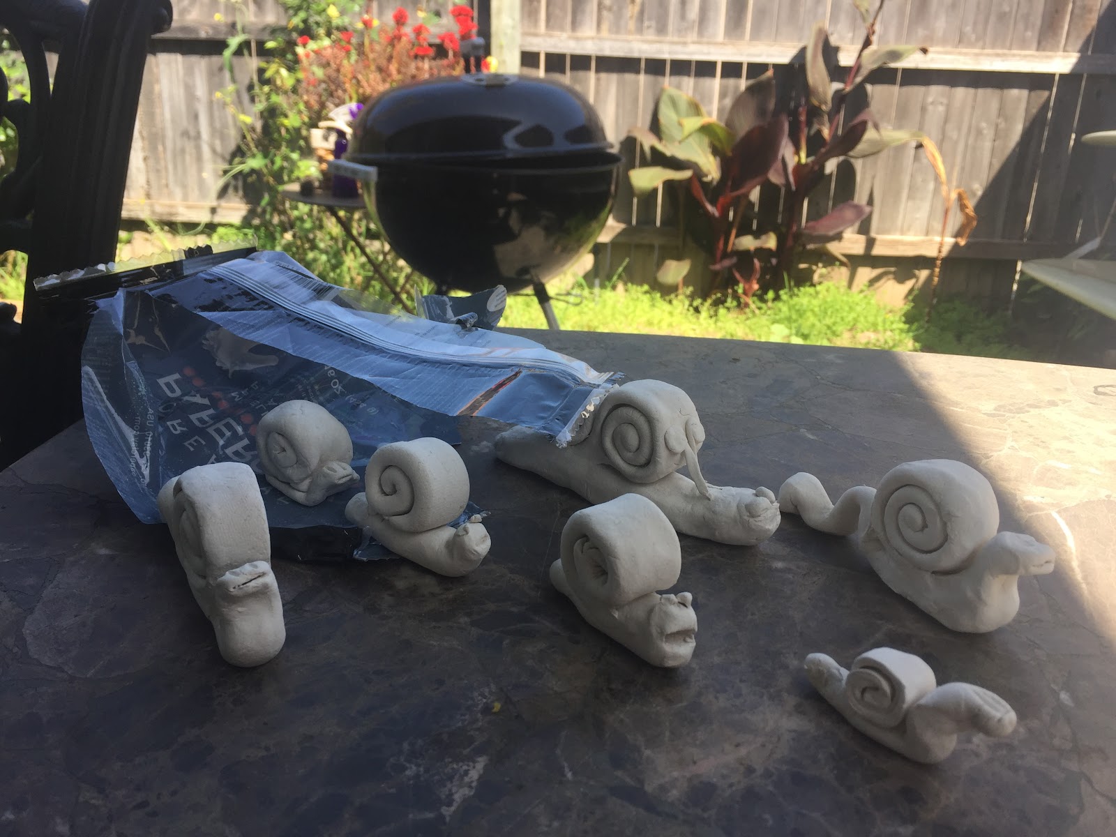
As a result, this is what my snails looked like:
IMG_4665.JPG

My idea was to make it appear that the snails, who were made from paper clay, had escaped their home inside the bag. They broke free, and are moving up and away from their confines as just paper clay. I spent a lot of time constructing the shell, but the faces were my favorite portion to create because of how weird and expressive they ended up. With mouths gaping wide and eyes poking out in weird directions, they look like cousins of one of Allison Schulnik’s army of clay creatures. 76d6f0945c7114c01f549a3eb211140d-scaled1000.png
When it came to choosing the colors for the snails, I found myself inclined to NOT limit my palette. Snails come in all different shapes, colors, and sizes, and I thought that I would honor this by choosing a range of colors on their body. Henry Matisse once did a piece in 1953 called Snail and I think it represents the ways in which I color blocked little sections of each snail shell. While this piece of art is more abstracted, it still emulates the spiral form and also uses color to accomplish a snail interpretation.

Self Generated Project

For the self generated project I wanted to combine aspects of deity worship with dolls or figurines.
I enjoyed drawing florals in my last project so that is where I started for this project.
I wanted to incorporate a living aspect in my project, so I chose real plants to be in my model.

Day of the Dead has always been an interesting holiday to me because of the artwork specifically. The bold vibrant colors and pop design intrigued me. This encouraged me to create a work with a similar vibe. Day of the Dead artwork encouraged me to use vibrant pastels with a black background, similar to the pictures below.

Day of the dead also commonly uses flowers because they are left on the graves of passed loved ones. The versatile use and meaning of flowers encouraged me to think about them as more than just a topic for a realistic drawing. The sacred-ness of a burial is a long running tradition, and flowers have been used for a long time in burial services. So, I lined my figure with small flowers, as if to suggest a burial or memorial of some kind.

I wanted my piece to be slightly more mysterious and ambiguous than typical Day of the Dead skulls, so I began to think about voodoo dolls and worship dolls, similar to the pictured below. There is something slightly humorous to me that we can place such deep meaning to something as simple as a doll. A part elephant part god, Ganesha, who was the "remover of obstacles and the deva of intellect and wisdom" can be reduced to a small, easily recognizable doll. While these dolls may be children from a kid's service at a Hindu temple, they stand for the same concept that 20' pure gold statues have stood for. Although they may not have the same impact they are representing the same almighty gods that have existed in Hinduism for thousands of years.

This aspect took my project in a direction of interpreting my figure into a drawing. I created a slightly more "godlike" figure than just a Day of the Dead skull drawing. The figure is meant to look slightly ghostly, and all-powerful, equipped with a two powerful staves, one of which was a leaf and the other a pine cone.


https://www.youtube.com/watch?v=SSJJi8WH9EY
https://www.youtube.com/watch?v=-Kx_HLwN_Pg
Coop Self Generated Project

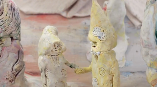
I was inspired by the animation characters created by Alison Schulnik and it made me think about cartoon characters. I took an interest in how simple the forms of the characters were. When I started to make my sculptures I cut the clay into equal sized pieces so the sculptures would have an equal presence.

I tried to acquire the mindset I have while I’m doodling  in class when I was making these sculptures. That is to detach myself from making something detailed or realistic and make really simple, mindless shapes. When I added the small eyes and mouths to the shapes they started to look more like cartoon characters or animation. The forms are androgynous but have familiar qualities as cartoon figures. In the drawing the characters are interacting with each other in humorous and friendly ways. I’ve never done a drawing like this before and was focused on maintaining an open attitude through the process.

This piece is also personal because I relied heavily on my own imagination intermixed with images of Dr. Suess characters and cartoon shows like Adventureland. I think these types of shows as well as Dr. Suess are very successful in creating characters that are fantasy-like and unique but also simple and obscure. The characters I made were more simplified then Dr. Suess characters. My sculptures are comparable to the simplest form of a thumbnail for a cartoon drawing. Although the shapes were formed without preplanning, the final shape of the sculpture influenced what type of facial expression the shape would acquire. For example on the round shape in the foreground the eyes are large and round and the mouth is big and smiling. The square has a neutral almost expressionless look.

The sculptures were personified and re-contextualized into a charcoal drawing. It now has a comic book appearance or a rough storyboard slide for a cartoon. I arranged the characters into a hilly landscape so they interact with each other. The sculptures were used to influence the landscape itself and the scene created. One sculpture turned into the indifferent mountain face. Another became the upside down clouds. The others became life forces, walking around the earth in a comedic way. The expressions are also humorous, some are shocked and others happy and droopy eyed.

Monday, April 17, 2017

Self- Generated Project

I have never used paperclay before so it was very fun to play with the new material. As I was sculpting it was hard to get certain shapes due to the nature of the clay, but I really wanted to create whatever came to me in that moment. More recently I have been in a defeated mood. I just don't give a fuck anymore about certain things. Sometimes it's when you stop caring so much and let go that things work out. I feel like that apply to my art as well. I am the type of artist that can get stuck on the details but I have been working a lot on being more lose with my lines.
So for this sculpture I wanted to express this mood i've been in. I just don't care about certain things. Nothing excites me, surprises me, or disappoints me because I just feel so numb to the subject. I felt too strongly about it that it exhausted all the feelings out of me. The character I sculpted has its eyes closed because it just wants to be done with the day. It’s ready for bed and it's trying to clear its head of all the noise. A middle finger is coming out of the head because all it can think about is that it doesn't give a fuck anymore. It can also be interpreted as a “fuck off” or “fuck you” because it is just so done with the day it wants to be left alone. The pipe and smoke signifies that the character it's trying to cope with this feeling. It is as if it is metaphorically blowing out all the negative feelings.
When it came to the drawing aspect to this project I wanted it to be very stylized. I wanted it to be close to my doodling style to represent the “I don't give a fuck” feel to it. When I am doodling I am not worried about creating a perfect piece I am solely just trying to express myself and let my thoughts go. I also wanted to color it with bring stimulating colors so that I could make the background dark and musky. I wanted the colors to give a more playful feel to it so that the artwork does not feel so depressing. This piece is not supposed to feel sad but rather feel hopeful. Even though this character is going through a tough time the colors represent the hope and the coping aspect.
An artist that  inspired me for this project is Cooper Richmond. I love his use of colors and the way he blends them. He has a way of using so much color but applying it in a way that is not overwhelming. So I actually asked him to help pick out my color scheme. I was also inspired by doodles I just found on tumblr and my own doodles of course. I do not have names of the artists that inspired my work due to the fact that I could not find their name on their artworks.


          Other doodle art artists: http://www.creativebloq.com/illustration/doodle-art-912775

Thursday, March 16, 2017

National Pornographic

This series of collage explores beauty in the male form. It raises questions about masculinity and challenges the double standard for nudity. These men are placed on regal and beautiful backgrounds. I chose things that were colorful and sublime. The background images are from a National Geographic edition titled “Wonders of the World.” I chose the most dramatic natural landscapes that I could find and many of the colors are so bright they appear artificial. The men are shown in nature. They are seductive but also resemble power when juxtaposed against the incredible forms of nature. These colors create a regal atmosphere that makes the beauty of the male body and the beauty of the natural world intertwined.

This piece is about many things but one of the things it addresses is censorship. It is common and relatively normal for women to be photographed nude, sometimes full frontal or even in promiscuous poses. Women are often objectified in the media and men are less so.

There are flowers covering the penises and other body parts on the porn models. The flowers are meant to interpreted as yannic symbols. I think there is something ironic about censoring male nudity with yannic symbols when addressing the double standard between female and male nudity. I wanted the collages to have shock value but still be censored to raise questions as to when to censor the human body and raise questions such as when is something beautiful and when is something objectification?

I have recently become very interested in defining masculinity and the role men can play in feminism. While this collage raises questions about censorship it is also supposed to show that some men, like women, are also objectified in the media and in things like porn. I would argue that many men being objectified in the media are gay. I truly believe that many straight men are not bothered by homosexuals, as long as they conform to “traditional” masculine ideals like being strong, dominant and competitive.

There are body image issues within the gay community because all gay men want to either be skinny as a model or buff as a bodybuilder and I personally believe that this fitness obsession could derive from a desire to be viewed as equally masculine as straight guys. It's another form or conformity. Another one of the reasons I chose gay porn stars is because they have perfect bodies that are god-like and unrealistic.

https://vimeo.com/179791907
http://www.chantarphotography.com/