Wednesday, May 17, 2017

Artist Bio

They say you never stop learning and as an artist this statement is as true as can be for many reasons. Firstly, there are so many different areas in art, so many different fields in need of exploration that we can never honestly say we have done it all. Secondly, assuming someone is successful in trying all the different mediums out there, there are so many different ways to alter and apply the skill acquired to the practice of art as a whole that there is an infinite amount of ways to make a work. This has been the driving force and my motivation in my undergraduate program. Throughout my years in school I have experimented with various mediums and techniques, succeeding in some and failing in others. Success made me understand new materials and grow in my knowledge of the art making process. However, it was in failure that I learned the greater lessons. Those materials that did not come easy to me were the ones that pushed me to take a step back and try different approaches. This challenge tapped into my problem solving area of the brain and forced me to put those neurons to work and sometimes change my entire outlook. For me, one of the most important parts of the art making process is where the mind goes and how far it can be pushed. I thrive amidst the challenges of the unknown. 
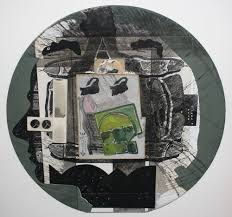
That being said, for my final project in my Advanced Drawing class I decided to experiment with a medium that is relatively new to me. I have previously worked with ink, but I had never tried to use it in a way other than the conventional ink wash drawings in black. To the right is an image I found online (artist unknown) of portraits done with ink. The work is very linear and does not include much detail but is able to successfully capture the features and personalities of the people. This time, I embraced the quality of the liquid and mixed it with water in order to get a chaotic and spontaneous background for my work.Since I knew I would be relying heavily on water, I wanted to use clay board for this work to ensure that it would not be damaged by the use of liquids. I allowed the water to make its mark as it was placed on the surface while I guided it to where I wanted it to go. There was a good blend of giving and taking in that I allowed the ink to be ink, to move freely, before intervening and moving it about. This allowed for a combination of random spots of color and swipes of a brush. This by no means created a harmonious environment, but one that is more reminiscent and nostalgic, imitating the blurred world in which our memories reside.

For the subject matter I wanted to paint portraits of the four rocks of my family, the four pillars that hold us all up through everything: my grandmother and her three sisters. I have always said that I may not have known my grandfather, but I was blessed with having four grandmothers, something that not many people can say. These four strong women raised me and taught me everything I know about values and my faith, something that is an important part of who I am. I struggled through the process of making this because I came to notice and feel the impact of the lack of documentation. Two out of the four sisters are in Mexico and they do not have any form of technology that would facilitate the exchange of photographs. This is extremely frustrating because looking through my photos of my travels I had the usual ridiculous food and animal pictures but none of my two aunts and unfortunately I do not have the luxury of driving five minutes to their home to capture them as I did with my grandmother and her other sister. More than anything, this project has opened my eyes to what truly matters in life and to appreciate all that I have. I love these women and I sincerely hope that this care and admiration can show through the portraits. Although they are not photorealistic, they capture the blurry memory feeling and even some of my frustration throughout the process. I will one day make portraits that are able to capture the beauty of these women in the future. That isn’t to say that these do not, because I believe that they do, but they capture so much more and that is my own recollection of them and nostalgia. In fact, last week I dreamt that I walked into my home and saw that all four of them were in the same room, that I was able to hold them all at once and nothing else mattered to me because my heart was full. This project focused more on emotion than technique and I am very proud of the result.


As mentioned before, these last four years of undergrad have been the key to opening the door to many different techniques, materials and ideas. I have had highs and lows, but they are all bricks that form the path that I will walk through my life to one day find my voice as an artist and will continue to walk and grow from there because there is so much to learn, this time is mine!

Monday, May 15, 2017

Artist Statement

This piece is composed of 5 small (6”x9”) black and white charcoal drawings, paired with one large (12”x15”) colored piece in chalk pastel. The small pieces are each a render of a 35mm film photo that I have taken over the past year. I chose portraits of each of the influential women in my life; a best friend, a sister, a mother, a stepmother, a grandmother. I chose these women because I wanted to choose a subject that deserved my attention, and deserved appreciation. I’ve spent approximately 2-3 hours on each piece, adding layers of preliminary charcoal, then layers of erasing to create the right amount of contrast and depth within the drawing. Then going in with charcoal pencils of varying strength to add detail and shading. The piece du jour was the addition of the white charcoal pencil, which nicely blends all of the charcoal and adds highlights where they are needed. It also creates a texture that is well suited for drawing skin and hair. I chose to leave the backgrounds blurred and preliminary as to add emphasis to the portraits in the center. Some of the photos were originally in black and white, some of them I edited into black and white, I chose this pallette because I was inspired by the simplicity and nostalgic effect of black and white in photography. It is also much easier to render shading and tones in the black and white format. Furthermore, I am particularly keen on charcoal, and I like to experiment with the small variety of strengths of the pencils.
As for the large piece, I chose to go in a different direction and chose one of my favorite color photos that I had recently taken on a solo camping trip in Bryce Canyon. I was inspired by the natural beauty of the landscape, and the impressive range in color within each individual photo, regardless of the contents. The photo I chose has a unique composition, of a large rock structure framed symmetrically by two angled trees, and a touch of greenery edging the rock. The rock itself has a gorgeous range in colors of tans, reds, and yellows. I chose chalk pastel for the same reason that I chose charcoal for the adjoining pieces, because of their texture and blending abilities. I like the contrast of this piece in color, and as a larger statement piece paired with the small black and whites.

I plan to stage this piece as a randomly arranged collection, with the pieces close together but not linear with each other. With all of the drawings together, I envision this piece to resemble a wall of family photos in someone's home, each one exemplifying a person or memory that is important to me. I intend on distributing the photos to each of the women in them, as to spread my rendition of home to people I love.

Artist Bio


Jackie Domi is a sophomore studying Film Studies, and pursuing a minor in studio art. She grew up in San Diego, the sunshine capital, and was influenced by her mother and grandmother who were artists, they specialized in watercolor and painting. She has approximately two years of studio art experience under her belt, having taken classes in painting, photography, and drawing. She has taken quite a liking specifically to figure drawing and still life rendering, dabbling a bit in expressionist abstract forms. Her favorite mediums are charcoal and chalk pastels, preferring the messiness and fluidity of the chalky textures. Her themes have ranged from real life rendering to mindless doodling. She hopes to continue expanding her artistic endeavours by strengthening her articulation of meaning and integrating existential themes in her pieces.

Final Blog Post

This project is centralized around the imagery of hands. This series has three parts to it. Two of which are connected by message or concept. With the collaged hands in various drawing mediums and water colored backgrounds. The third piece is a mixed media piece which was done with a different meaning behind it.

The collaged works have a watercolor wash background transitioning from lights to darks with use of yellow and red and the other page with blue, purple, and black. The washes color are relevant and reflective of the timeliness of the person's' life. Also the different mediums used to make the hands are relevant to the age that I personally have learned the individual mediums. Starting with pencil, then charcol, ink, color pencil, and lastly marker which was a first attempt in this piece. The use of the different mediums shows different applications of styles and tools to represent a similar image. The concept of the piece referencing aging and deterioration and with continual grown along with age. Which is referenced or helped defined with the different use of mediums and the color pallet of the hands and the washes they are attached to.

The third piece which is a metal plate displayed above the collages has a different concept or meaning behind it. The outline or shaping of the hands are meant to look like a person begging or asking with humility. Either for food or money. The dark outline of the hands is made out of coffee grounds and glue. Which was first drawn on the metal or silver plate in sharpie. To implement so drawing medium to this piece but allowing the expansion of usable materials and presentation methods. The contrast of the black or dark color from the shiny silver is meant to reference different class systems within different world societies. With the brown being coffee grounds this references the “dirt” poor population which exists both in the US and in other countries around the world. Even though the “dirt” is really coffee grounds but the similarly in color and consistency allow the look of dirt without the sent and inconsistencies of actual dirt. The silver plate with the embroidery and extravagant patterning references the upper class who live life in extravagance while others are resorting to eating dirt. These issues are something that many want to resolve but the issue is challenging. However in certain countries such as North Korea where only the military is cared for while the general population is scraping together what they can to survive.

Artist Statement

Artist Statement:

I was never much of a doodler, but when I did it was always flowers. It wasn’t until this year that people starting pointing out my affinity for flowers. They had always been stuck in my art subconsciously. Flowers come natural to me, they are embedded in everything I do, but never the focal point. Flowers are safe, calming, nostalgic. My discovery of my affinity for florals lead to an exploration of my past, my mother, and a departure from the comfort of simple flowers. This project affirmed much of my childhood feelings, but also encouraged me to grow and confront the reality of a flower; a flower is a beautiful living organism that will eventually fade.

Artist Bio:

Tristan Fields was born in Denver, Colorado in 1996. He is pursuing his BFA in Studio art, and a BS in Business Administration at Chapman University in California. Tristan uses art as therapy, relaxation, and expression. He finds inspiration from human connection, family, and his early life. He is a multimedia artist who uses drawing, sculpture, collage and installation to convey his concepts.

forget me not!

Izzie Panasci - Final Project: Forget-Me-Not!

Artist Statement:

The human memory is limited in more ways than most people think! As a species we cannot clearly recall on any given memory. Instead, we end up using small neurological connections that to help us reference specific moments and events in our lives. This explains why people feel that they remember events that actually never took place, or that "something is on the tip of their tongue" but end up struggling to remember anything about it. This is even more prevalent in regards to remembering people's faces. Most of the time it is extremely difficult to recall the exact shapes and features on the faces of people dearest to us. I started exploring this idea in some collage projects earlier this year in which I drew the same face from memory several times. Each of these freshly drawn characters had a feature or aspect about them that looked a lot like the person I was thinking of. Combined, they truly did represent the person I intended to draw. My ability to capture personality in my portraitures of others was helpful because it united the characters I had drawn into a cohesive group. 

I have expanded on this idea in my final project "Forget-Me-Not!" 
By carefully selecting friends and family with distinct features and appearances, I built a small army of characters that represented my memories of the people themselves. After looking quickly at a photograph, drawing images from pure memory allowed me to show the many expressions each of the people make. While each cup is designed to emulate the persona of the individual drawn, I intentionally did not draw them in a hyper-realistic way. I let the cartoonish aspects of their features overtake the cup, and did not to let potential facial inaccuracies interfere with my drawing style. 

Creating these people on cups instead of on paper allows for one to see how the same character could be in conversation with itself and viewers all at once. Some characters on the cups gaze across at each other, while others stare right at the viewer who is standing before them. Since each cup is suspended from the ceiling, the viewer is able to walk around each cup, checking out each of the person's expressions. Having these characters drawn onto a dimensional surface allows the objects to have more presence in the space they are presented in, as a real human would! The viewer can treat the cups more like they would the individuals, walking up to them and studying their expressions as objects in space rather than as figures drawn on paper. 


Artist Bio:

Izzie Panasci was born in San Francisco, California in 1997. She is currently an undergrad at Chapman University where she is majoring in animation and minoring in art and anthropology. The majority of her work reflects her interest in the micro expressions of those around her, and is accomplished through a manic-like attention to detail. She tends to focus on capturing the personality of her subjects, and has developed a very individual style through the use of precise line work. After graduating she hopes to create animation films that tell ethnographic tales about different communities and groups of people. 

How the following artists and pieces inspired me: 


robert crumb

Robert's work is inspiring because it is as manic and detailed as I strive to be in my work. I appreciate the small scale in which he chooses to illustrate because it makes it possible to actually accomplish the envisioned details. Whether he is stippling or just drawing perfectly straight lines, his comical portrayal of people communicates a lot about personality, humor, and identity.


aline crumb 
Aline, Crumb's wife, loosens up her grip on the pen which I can also appreciate. Creating more fictitious representations of people and their mentalities, she has created a style that focuses on line work and facial expressions. I like how simple she can keep each character yet maintain a stylistic attention to detail in the overall image. 


ray pettibon
Ray's work embodies the beauty of light-handed line work. I am inspired by his "knowing when to stop" a common issue for me in my work. His simple messages and drawings make his underlying messages like "fuck housework" more dominant in the message of his pieces. 

Julie Doucet
Julie Doucet has a style that I would like to feed off more- it has a refined sense of looking both comical and realistic all at once. Her detailed scenes and portraitures show me new ways of using line work to create depth and capture light. I think a lot of my cups have drawn inspiration from her (and my own) oversized eyeballs look. 
 https://www.youtube.com/watch?v=D-vs5hZu744


Sunday, May 14, 2017

An Autobiographical Map

Statement

      The process in which I executed my final project, "An Autobiographical Map", I have fled from my traditional project planning of my artwork and was pleasantly surprised to find beauty in impulsive and odd ways to produce an image. The most important aspect of creating this piece comes from the shapes that later turn into a landscape of emotion and character. I find pleasure in expressing my experiences through color and creatures that convey a specific response to the piece as a whole.
        The physical experience of creating this piece felt so natural and inviting to finish, I had no trouble dealing with issues and obstacles along the way. I also felt free to use any drawing mediums I could find around the house. I used an assortment of materials, including acrylics, gauche, watercolors, glitter, marker, ink, etc. Starting with a blob of color or random shape, I build off of a detail with more detail until there is no more white space. 
        "An Autobiographical Map" was majorly influenced by a question I am frequently posed: what is art? Art can only be created with intention of some sort. If there is no intention, is it art? I find that my final project plays with the idea of formalities in gallery setting, but I also literally represent this playfulness through vibrant colors and graphic lines. On one hand, I would like my viewer to become lost in the variety of textures and patterns in my piece, but on the other hand, also question the rules or limits of the art market.  
         I have also always been deeply influenced by Frida Kahlo's work and her life story. She went through many painful experiences that prompted her to start painting these beautiful, symbolic self-portraits. She incorporated grotesque and vibrant colors to portray her torment. In my final project, I use cartoon-like characters and playful scenes to convey the current anxiety I feel in my life right now. 
         This piece is also a large-scale continuation of my sketchbook drawings, in the sense that I uphold the freedom to doodle on a canvas and focus on filling the white space. I enjoy creating art this way, especially in times of stress and pain. This semester of school was extremely difficult for me, and a major escape is my sketchbook and journal, which gives me more of an incentive to create a project that makes me excited, rather than stressed. The layers of colors I overlap and the patterns that flow together in "An Autobiographical Map" are imagery I create from impulsive mark-making, which help me lose myself in my work, focusing on the shapes and colors on the paper. 

Bio:
I am originally from San Francisco and moved to Orange, California to attend Chapman University. I am currently going to be a junior, majoring in Studio Art with a focus in painting and drawing. My interests and focuses are primarily creating work that furthers my journey as an artist, but also to express myself in some sort of physical way. My goal, as an artist, is to convey transformative work that conveys my progression/ timeline as an individual in society. I am overjoyed when people recognize my work or feel affected by it somehow. I think it is important to express yourself in a physical way, whether it be drawing or writing, or even just running, to create a tangible experience or object and reflect on it for personal growth. 


http://bryanlewissaunders.org/drugs/

https://www.gavinbrown.biz/artists/kerstin_brtsch/works


Friday, May 12, 2017

Final Artist Statement

Trigeminal Transcendence 

Artist Statement:
About 6 months ago I was diagnosed with Trigeminal Neuralgia, which is a chronic pain condition affecting the trigeminal nerve (cranial nerve located on the sides of your face.) On average I get 2-3 episodes of pain a week and on a scale from 1-10 the pain usually spikes to a 12 and sometimes a 14, ranging from an hour to 6 hours. My neurologist prescribed me muscle relaxers on top of one of the strongest painkillers called Zohydro Codone (vicodin). It is illegal to produce in most states (including California) but can still be sold here through a pharmacy. I had to order mine from Mexico and it took the longest week of my life to arrive. Funny fact, my neurologist also told me it’s the closest thing to heroin in a smaller dose. So at least a small perk of this condition is that I get some street creds.
The effects of this painkiller is very gradual, and it slowly numbs your entire body out. It can give you an out of the body experience because you can’t feel the weight of your body and it does not feel like you are inside yourself. Sometimes if the pain gets really bad and I have to take two, but that is the limit. Adding another pill can sometimes make me very dizzy and cause nausea. As bad as that sounds, the side effects beat having to go through the pain. The pain feels like a thousand needles stabbing me all over my face. It also causes my muscles to cramp up from being so tense. Do you remember when you were a kid and your tooth would fall out and your gums would be so sensitive? Well picture someone stabbing that with needles. That's a glimpse of what the pain can feel like, it's hard to express it in words.
For this project I wanted to do a series of 6 automatic drawings that are 4 1/2 feet long on white paper. I wanted to experience what kind of art I could express while I was coming down from my pain. So for every episode I experienced over the course of a week and a half I would do two drawings. One drawing during the pain and one after the pain killer started to work. This way you can see how much the drugs affect my body. It was very difficult to draw while in pain, not only was it a mental battle to keep going but half the time my eyes were shut. It helped me deal with the pain with my eyes were closed. So when I felt done I would open my eyes to reveal gestures that I would have never thought to make. And once I was done I would take the painkiller and wait till it kicked in. It was a surreal experience to be able to draw while my entire body was numb. My mind was completely clear and I knew exactly where I wanted my hand to go but my body was slow and not a precise as I wanted. It was a mental struggle and I had a hard time accepting the art that I created. I am the type of artist who needs to be in control so this was a very different approach for me. The reason why I wanted to use such a wide sheet of paper was so that I could use my entire arm spade and move freely across my drawing. This part of the project was liberating and I loved being able to swing my arms around.

Artist Bio:

Kristi Fujii was born in Fremont, California in 1994. She is receiving her BFA from Chapman University this year. Kristi has exhibited her works in numerous shows on campus as well as off campus at “A la minute”. She used to be a graphic design major but recently in the past year has found her calling in painting and drawing. Most of her work deals with how the body interacts with the mind through physical and psychological conditions. She is now located in Orange, California but will be moving to San Jose to continue her work as a graduated artist.

Thursday, May 11, 2017

Mail Art

When I was young my family spent a lot of time camping, biking, fishing, etc. Our family was big on mountain vacations and enjoyed many cliche activities in Colorado. My parents are both originally from Wyoming, a low density populated state with a lot of wilderness. My grandparents still live in the small town of Riverton, and my grandmother lived in Lander until she was about 80 years old. I have fond memories of these towns, and the adventures that came with our vacations. My mother and I still visit whenever we can, although the trips have become less and less frequent. However, when I visit in the summer I am flooded with nostalgia. Memories of blooming summer flowers in my mother and grandmothers garden. My grandparents have over 25 acres of land so they also have vast amounts of wildflowers. This feeling of happiness and connection inspired me to share my love of flowers. However, I didn't just want to draw flowers, I was more interested in conveying the actual sensation I feel towards flowers. As I wondered how to do this a pressed flower fell from a book my mother had sent me a couple weeks prior. Pressing flowers is a hobby my mother picked up in her late teenage years, in order to collect and preserve beauty and memories. I wanted to not only carry on this tradition, but understand more about my mother and her pre-child years. This lead me to the second part of my project, understanding how we are all pieces of other people, how we construct ourselves from parts of other people. The poem I wrote for this project has a lot to do with thic concept, and all the mail art together add up to make a whole poem and a larger piece of art.


https://stuartmatthewsphotography.wordpress.com/2013/04/09/mail-art/
http://nashvillearts.com/2015/06/letter-to-me-mail-art/

Wednesday, May 3, 2017

Mail Art

For this project we went back a few years to a time when phones were not smart, when mail was slow but reliable, and when social media was nonexistent. This time we made artwork that could fit within the bounds of an envelope and handed into the possession of strangers in the hope that they would be sent to their respective destinations. It was a new and fun way for me to look at art, to look at it with a sense of purpose, with each one being made for a specific person; it had an audience.

One artist that I looked at was Ray Johnson who was known as a correspondence artist. He is among the founders of a mail art network. I watched the video, ‘How to Draw a Bunny’ which chronicles his life and the people with whom he worked. It includes interviews with various artists of his time. From what I gathered, he was a fascinating man, I dare say an enigma, because his way of working was both humorous and puzzling to those that received them. His work was mostly collage, with some drawings. Here is an example of his work. I would write an entire post about him, but for now I will focus on how he affected how I approached my work. I decided to mix the idea o collage with drawing, but adding my own twist. Instead of cutting and pasting papers on top of each other, I decided to weave together different types of paper with different textures and opacity. On top of the collage, I wanted to incorporate my drawings, in my usual linear and loose style.

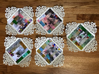
I wanted to cut the papers into long strips of uniform width and length in order to create individual squares all of which make up a larger image. To the right is an example of weaving different papers and textures that i looked at. This was in part inspired by the work of Chuck close, a painter who makes portraits in a very unique way that I have tried to recreate many times. This time, however, I tried it with paper instead of paint, which I think has been the most successful one. He works by making his surface into a grid and painting each square individually. Up close, there is a world of its own, with seemingly random colors in each square, but when looked at from a far, you can see the image they make.
 
When thinking of the subject of my work, I came up with the idea of sending something beautiful, something that when I look at, I am overcome with happiness. I decided to send everyone a picture of my dog. Each image was specially chosen for each individual to add a little personalization to the work. I used reflective, iridescent paper that varied in transparency and hue, which gave my collage a playful almost random look to it.


Overall, this project made me think of the process of making art in a different way. To think about it as being made for a specific audience, personalizing it based on the person who would receive it while still maintain my style. It was a lot of fun, although I felt anxious leaving it at the mail, fearing that it would get lost or delayed. That, however, made it even more fun, and as discussed in class, it gave me a lesson on deadlines: work fast effectively, and especially take into account the lack of control in delivery.